UI & UX Design
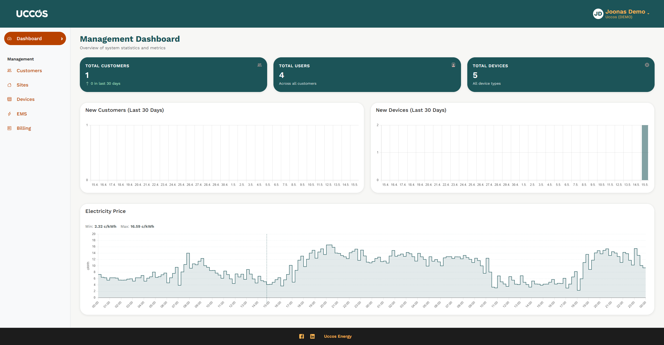
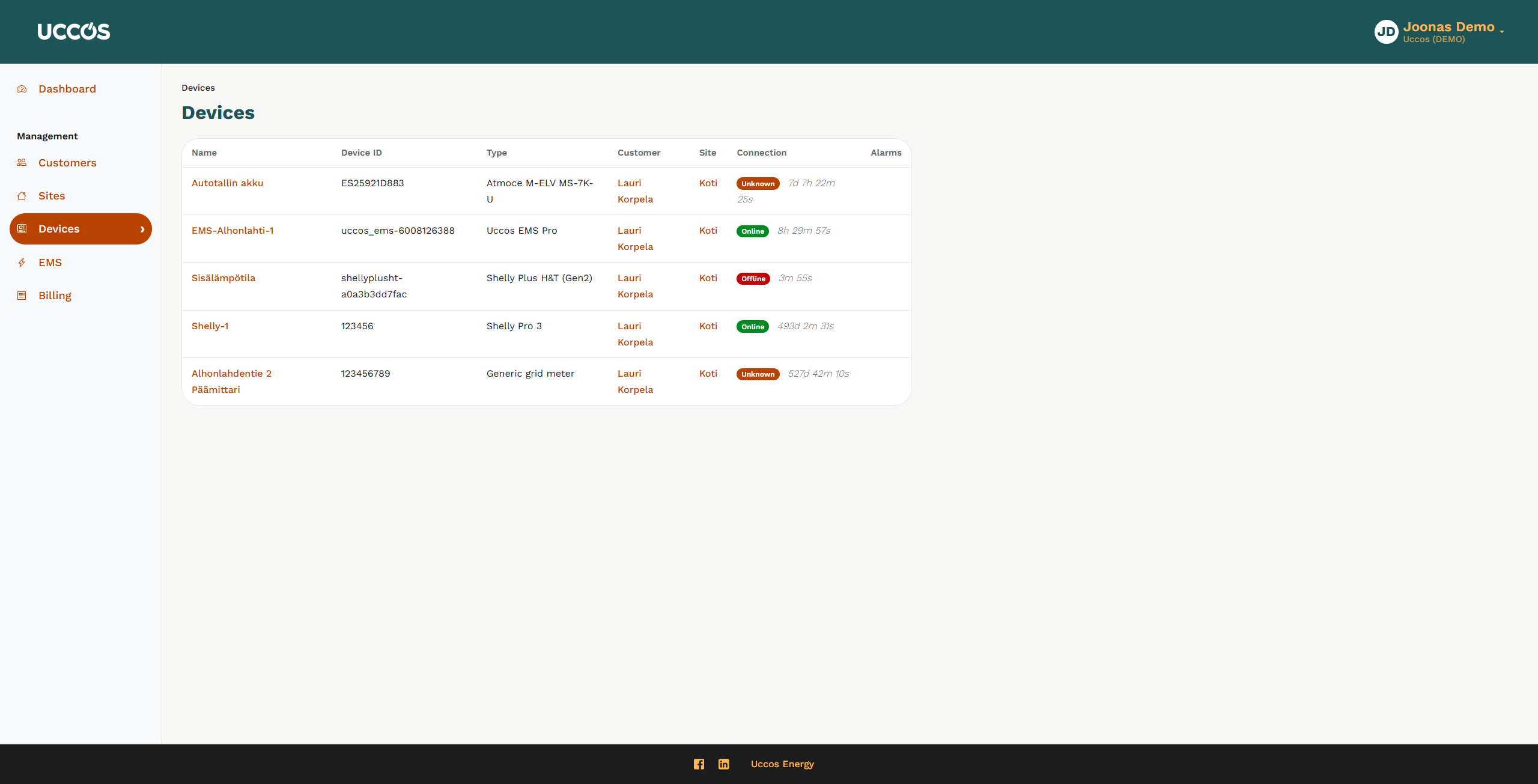
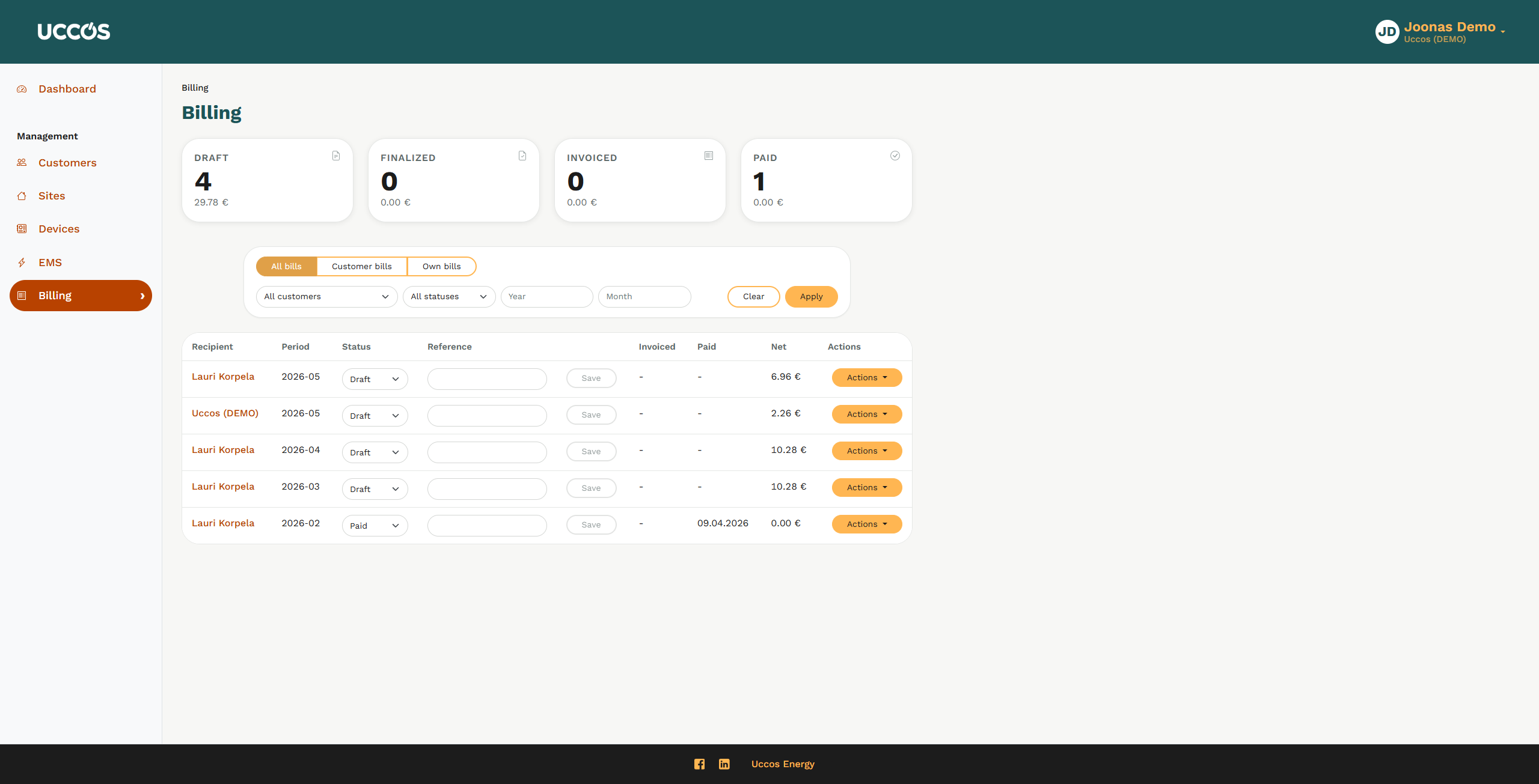
Uccos Energy is a startup operating in the energy field and provides aggregate services to companies and private citizens to manage, optimize and sell their electricity storeage output on the market.
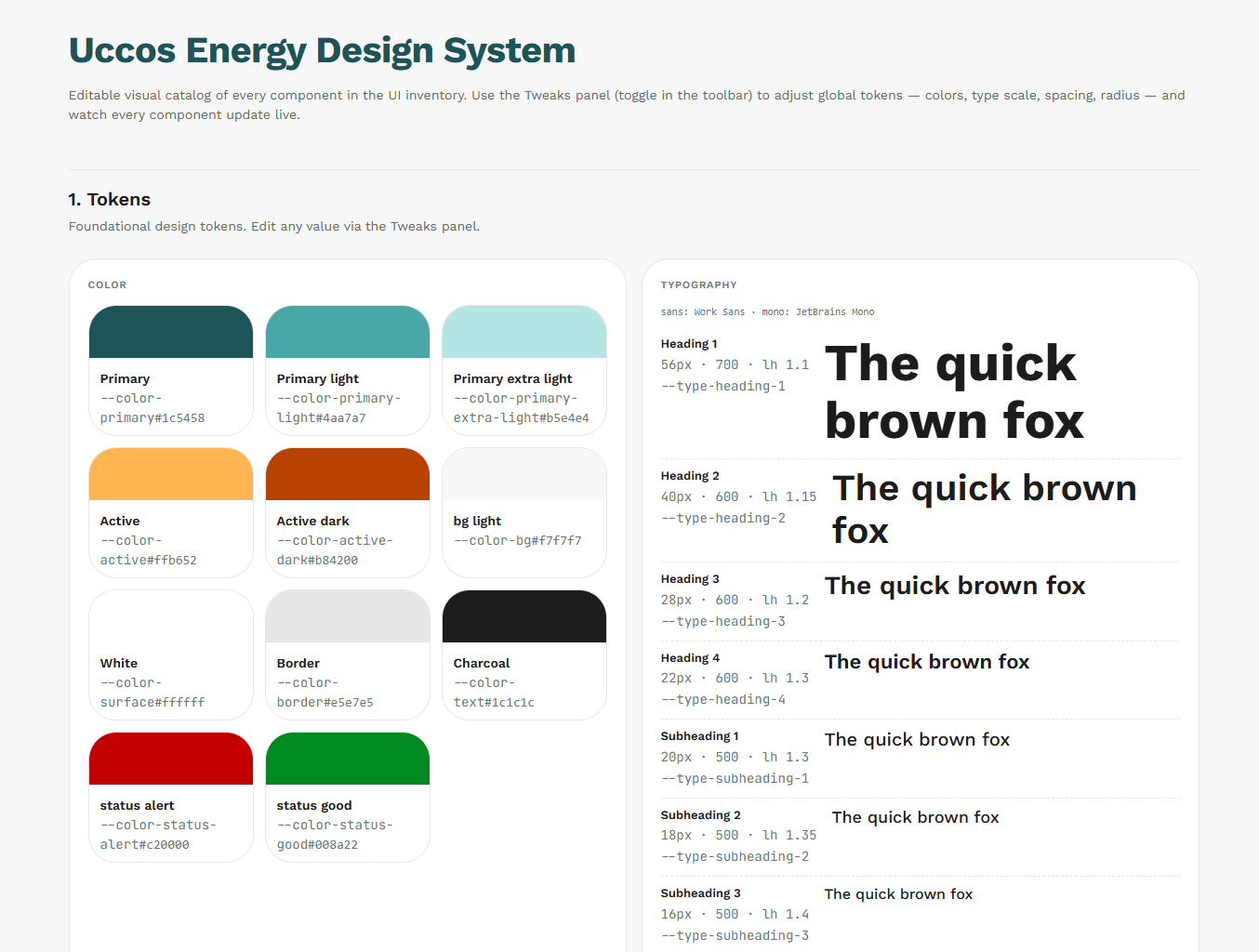
Uccos has beeen a strong advocate of agentic AI-assisted software development since their founding. They had a need for a Design System optimized for that particular use. After some research we decided that the Design System would be created in Claude Design, and specification and instruction files for the AI tools from it would be exported and hosted in the company’s Git repository so they could be accessed centrally by the developers and engineers at Uccos who are using tools such as VSCode and Copilot. The specifications could then easily be updated by pushing an update to the design repository, and the developers can get the updates via there.
The Design System contains specifications for all of the design tokens required for their development needs such as color codes, typography and spacing rules, component specifications from the atom level all the way to the organism level and a large collection of UI components. The start point of the project was the POC-level UI of their web service, and it was easy to list all the components required to fill the UI needs of the current version.
Using a Design System created with an AI tool, optimized for Copilot use from a Git repository with AI-assisted software development tools brings many advantages compared to a manually created one:
- The changes and specifications are in a form that’s directly understandable to frontend software development tools – no “translation” by a developer looking at a layout
- The Design System lives in the same place as the software project, the Git repository, and can easily be both accessed and updated there
- Claude Design is an excellent tool when handling a large number of design tokens and can make sweeping changes quickly that would take me a significantly longer time
- Accessibility specifications can be baked into the Design System so the Copilot-assisted software development tool will always create e.g. WCAG 2.2 compliant layouts
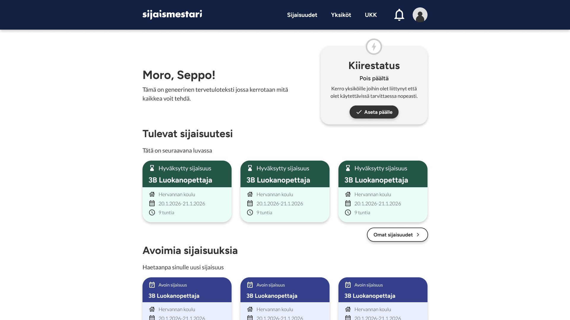
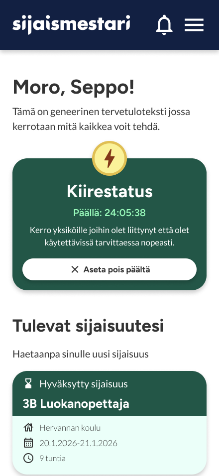
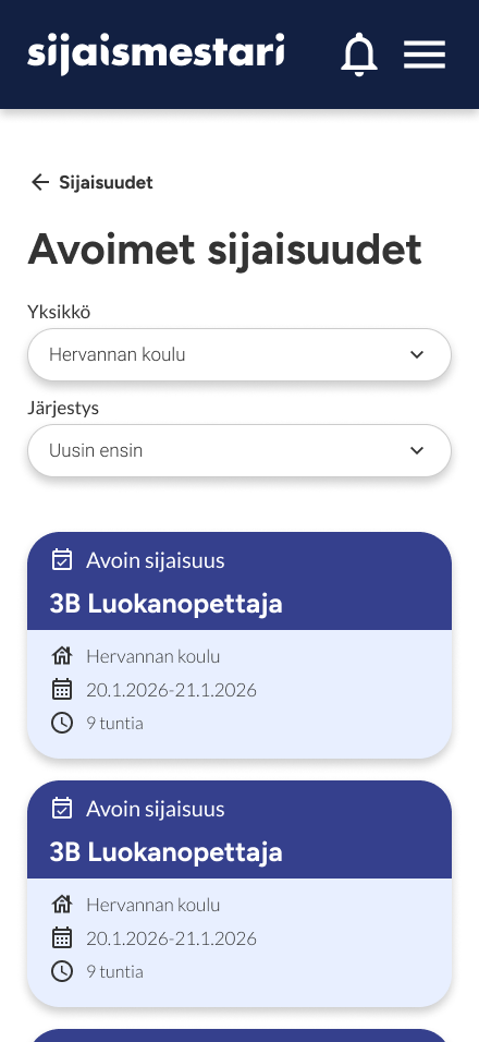
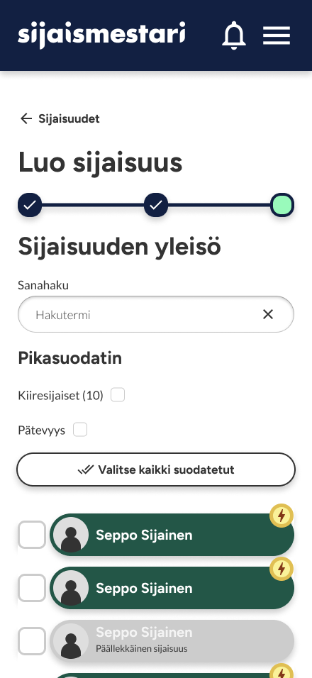
Sijaismestari is a web service that connects substitute teachers with schools and kindergartens. It aims to gather all of the communication and scheduling tasks related to managing substitutes and gigs under one simple application, as previously this has been all done with personal correspondence through phone calls or IM messaging.
I was brought on this project to work as a Designer to first refine the users’ path inside the application and to critically review every part of the flow the users face when using it, to best serve the user’s needs and the business goals of the client. After that it was time to create the UI & UX first by wireframing all of the user flows, and then to create the UI prototypes for both mobile and desktop views with a light Design System and visual identity that was in line with the client’s brand.
The project was extremely rewarding and a perfect example of how interesting it is to wrap my head around the concepts of a field that’s completely new to me, in this case education, and then apply it to design decisions that serve the client and users as well as possible.
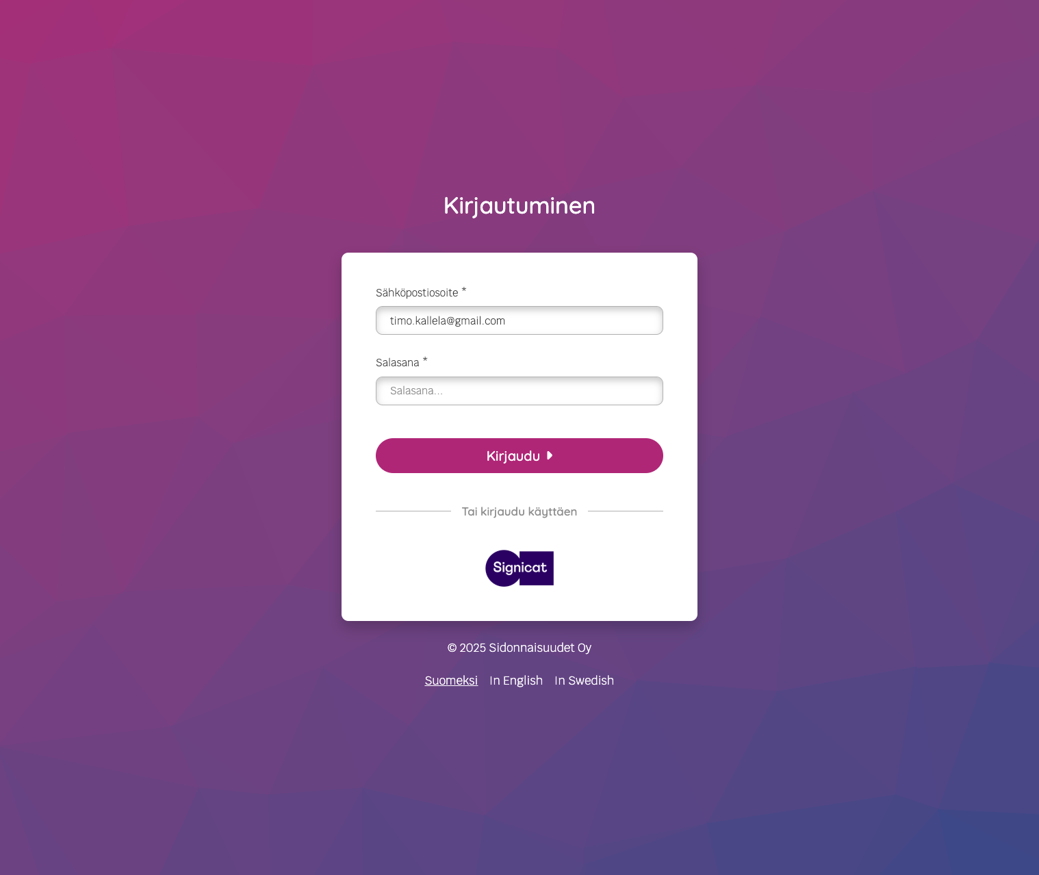

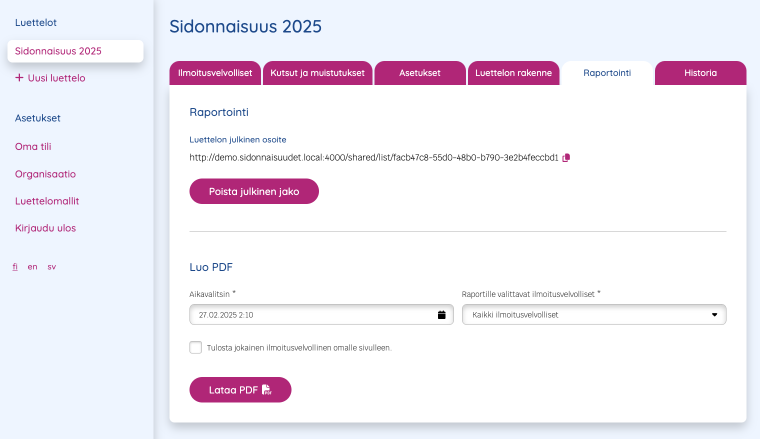
Sidonnaisuudet.fi is a SaaS product aimed at e.g. municipalities and other governing bodies such as boards, to manage liability registers to track and display declarations of interest. I was tasked with designing a few example views for them and a component library to act as the start of a Design System with intention to be built upon in the future, in addition to designing and building a website with WordPress. Working with table-like structures in Figma is challenging, but the components produced are meant to act as a guideline for visual styles and not work 1:1 with real life tables. The product was announced at the start of 2025 and will be developed more.
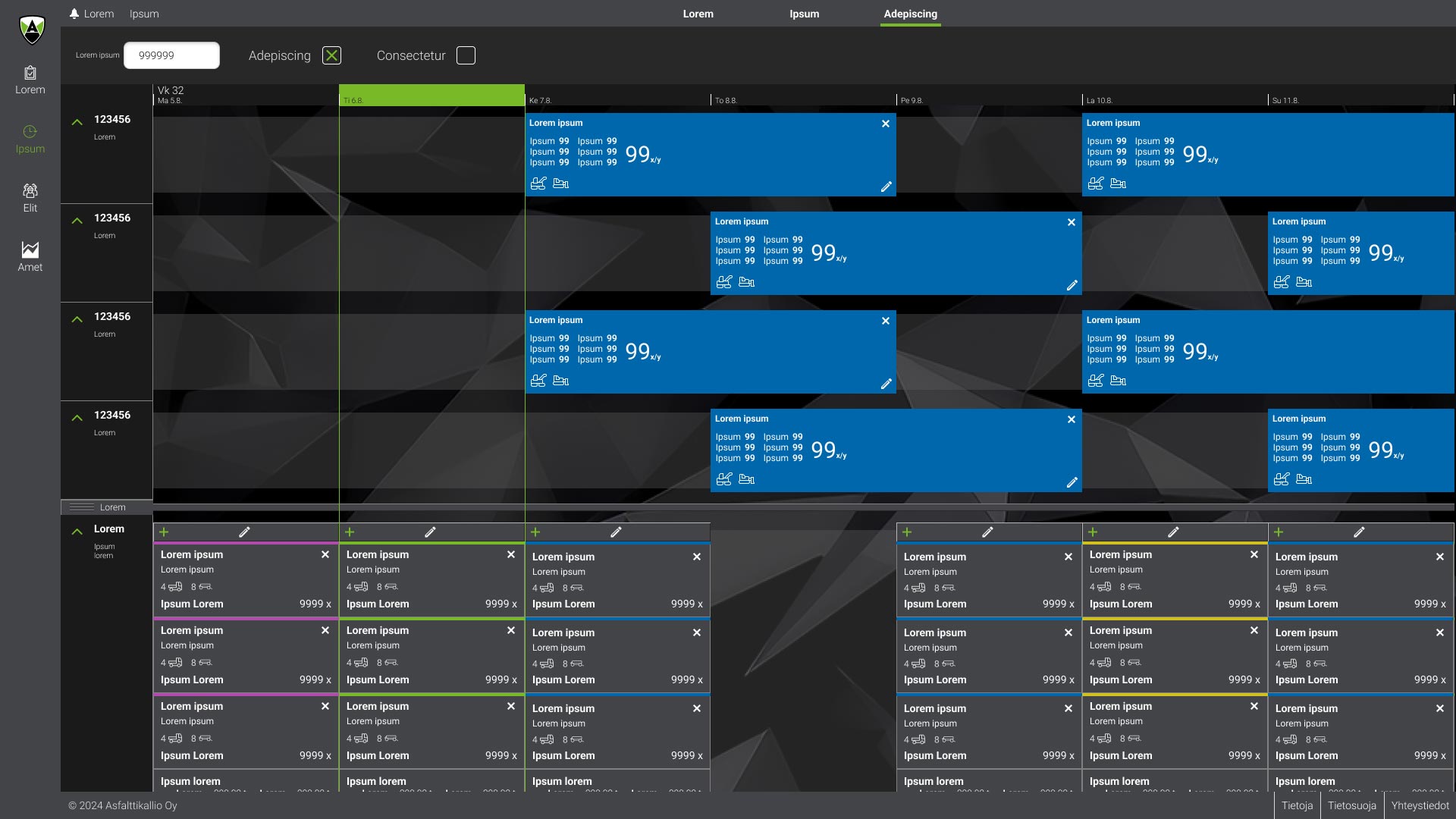
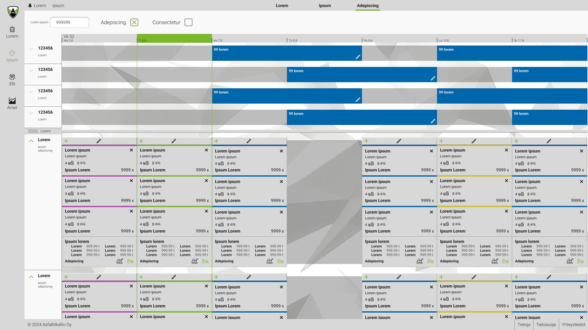
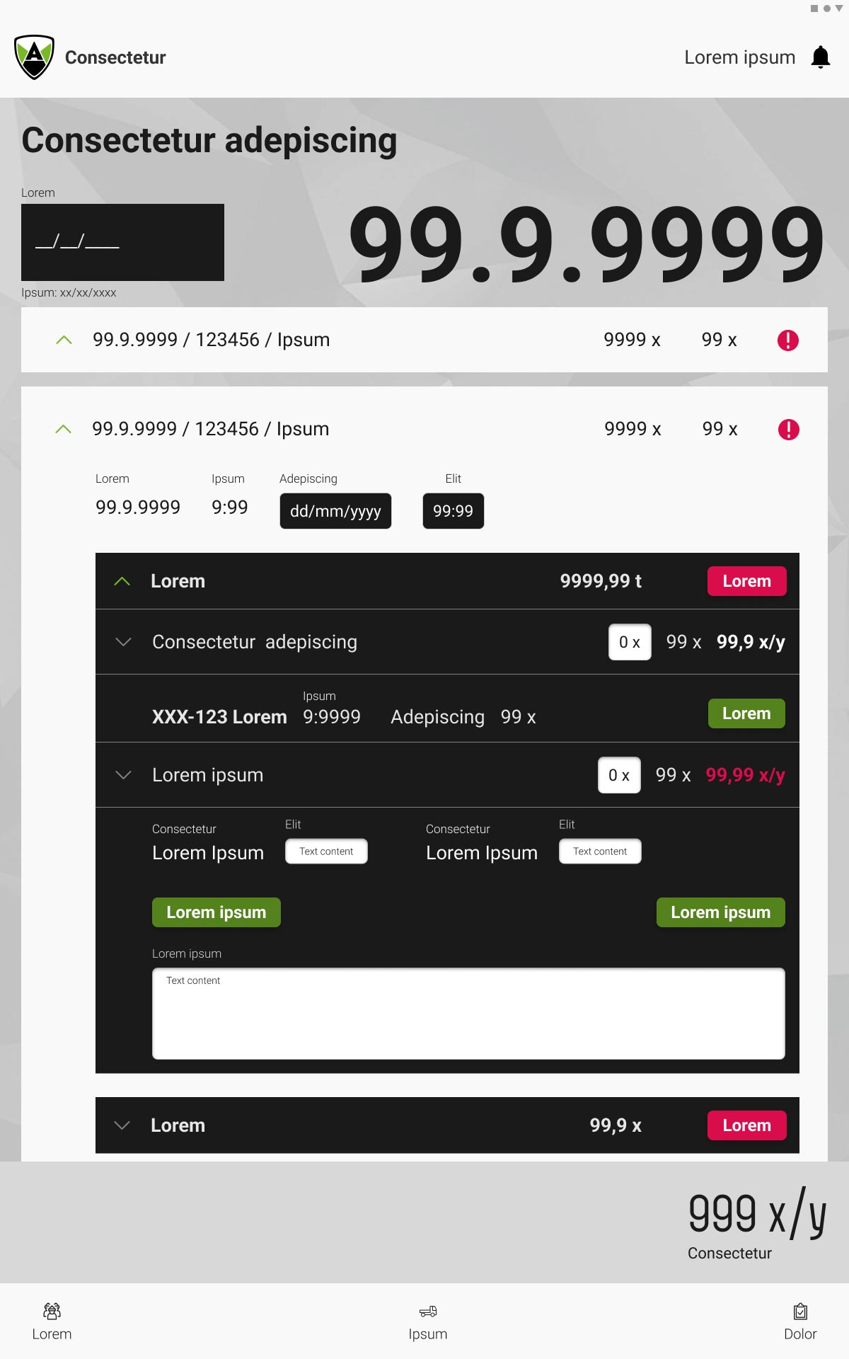
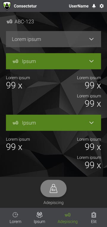
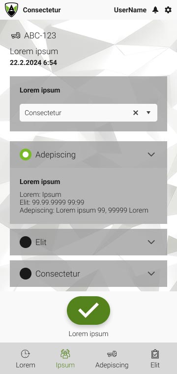
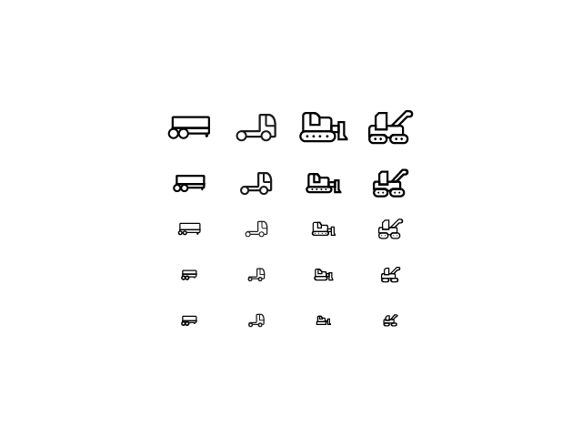
I was part of the team that developed the Asfalttikallio ERP. The expansive software is designed for their daily operations and contains a wide variety of tools and features specifically customized for their needs. I was brought into the team as a Figma expert supporting another Designer in the project restructuring the views to better support the project’s developers, in addition to designing a set of custom icons in different sizes. Additionally I started a light Design System & component library to future-proof the project further facilitate the building of new features and new development, and to consolidate the previously built assets and guidelines in a central place for easier access to both Designers and Developers. All of the components and views were built for both Dark and Light modes in different sizes for Desktop and Mobile use for better accessibility and customizability.
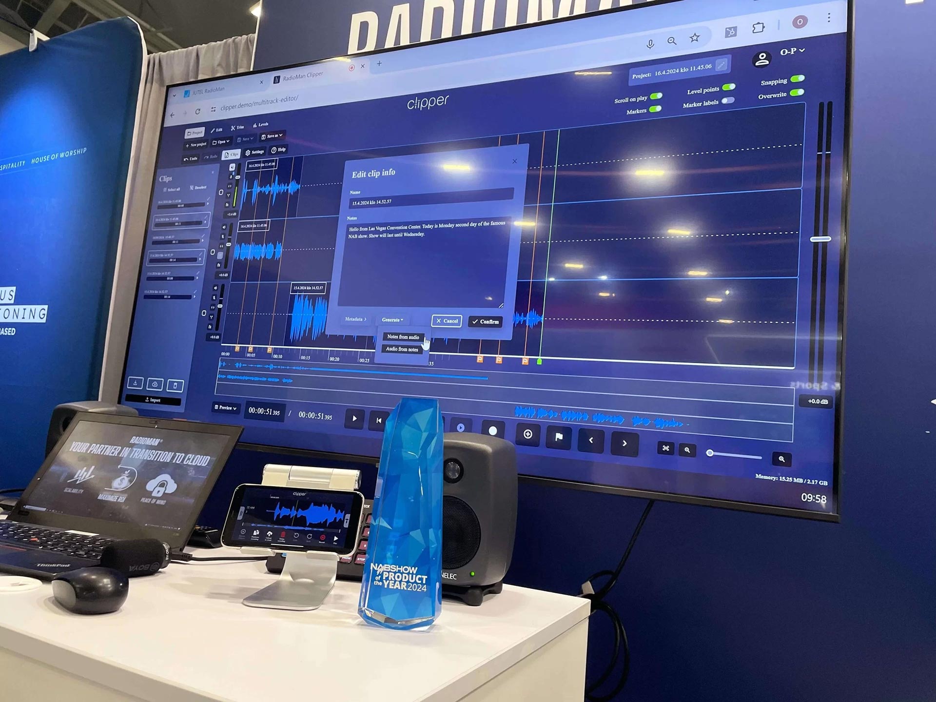
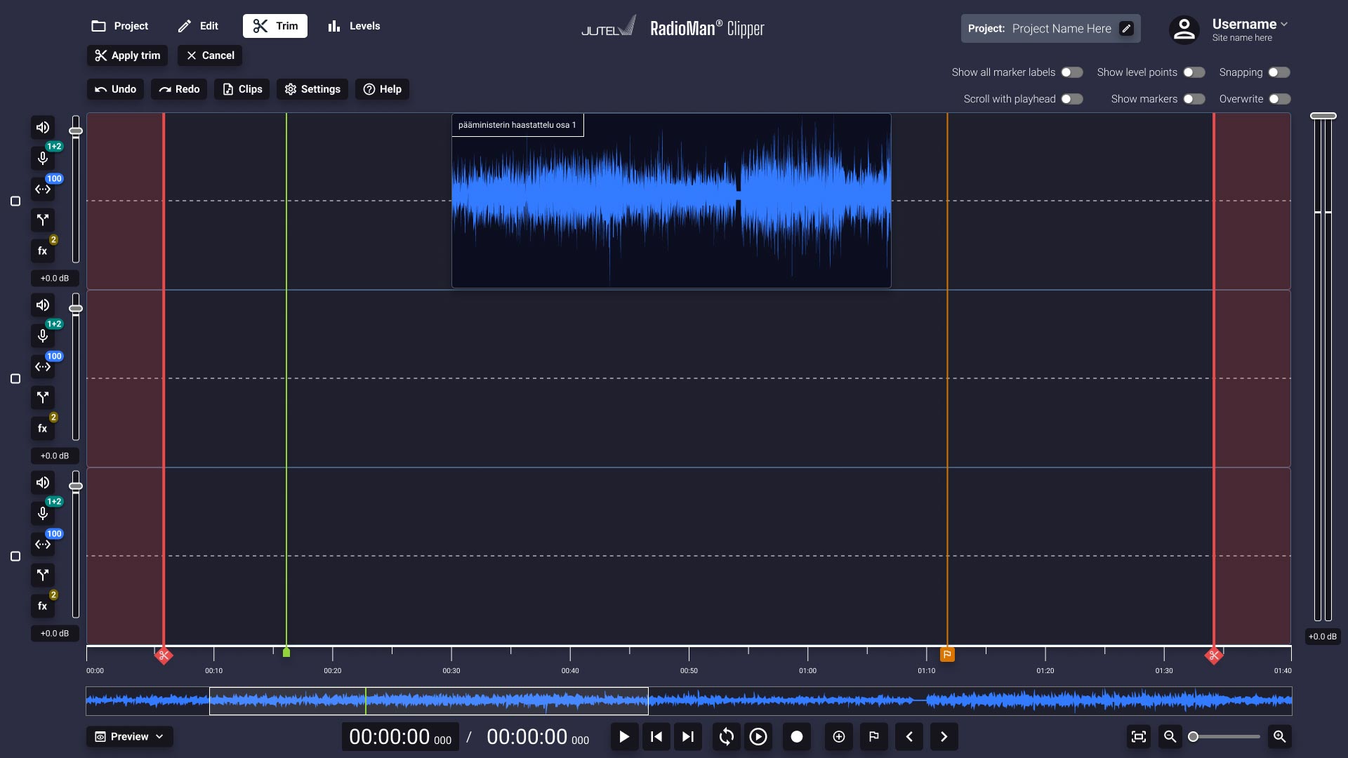
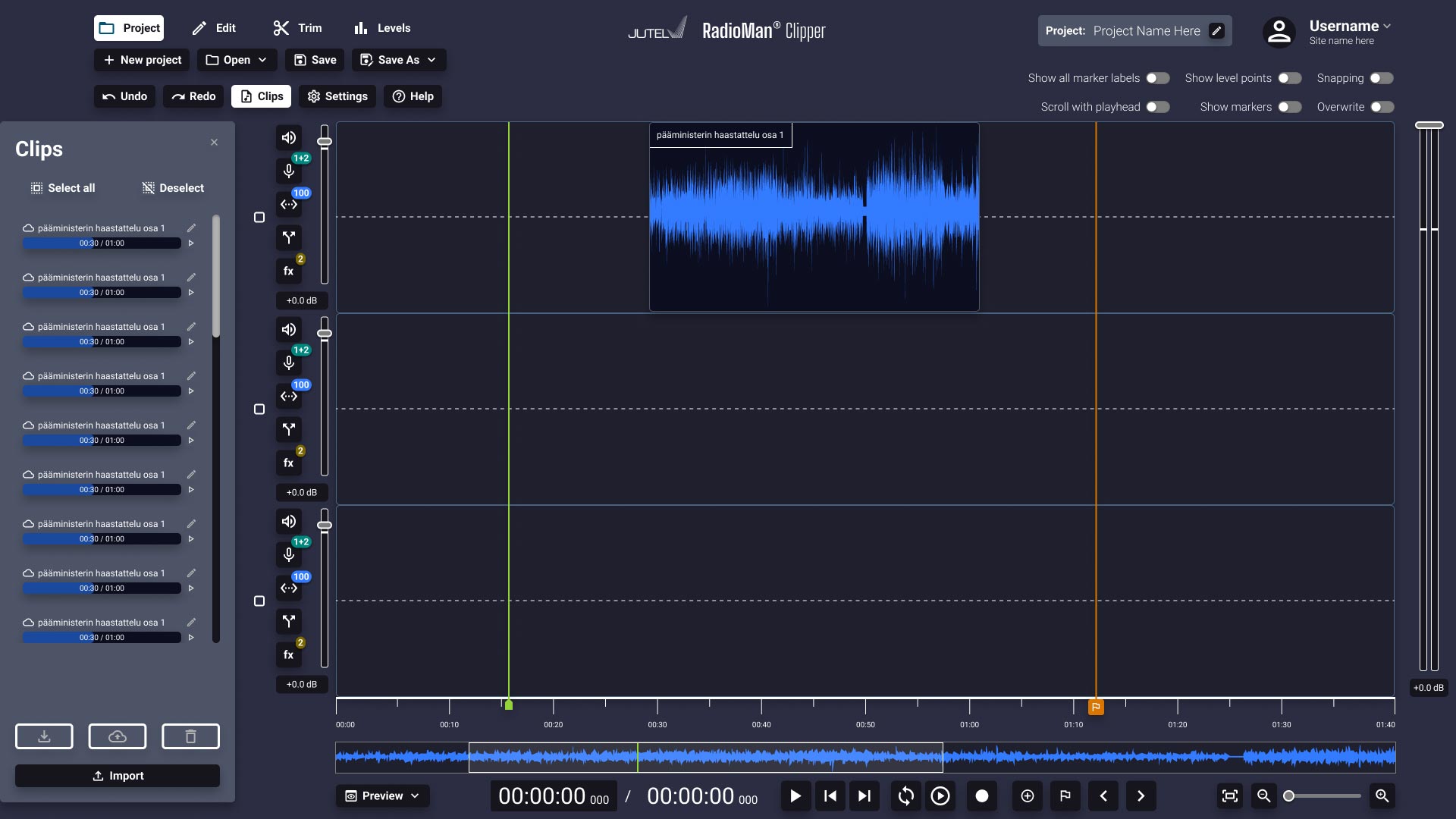
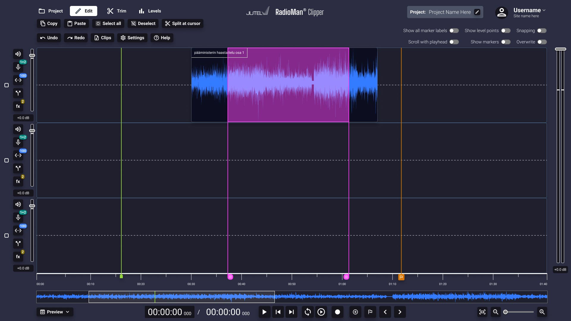
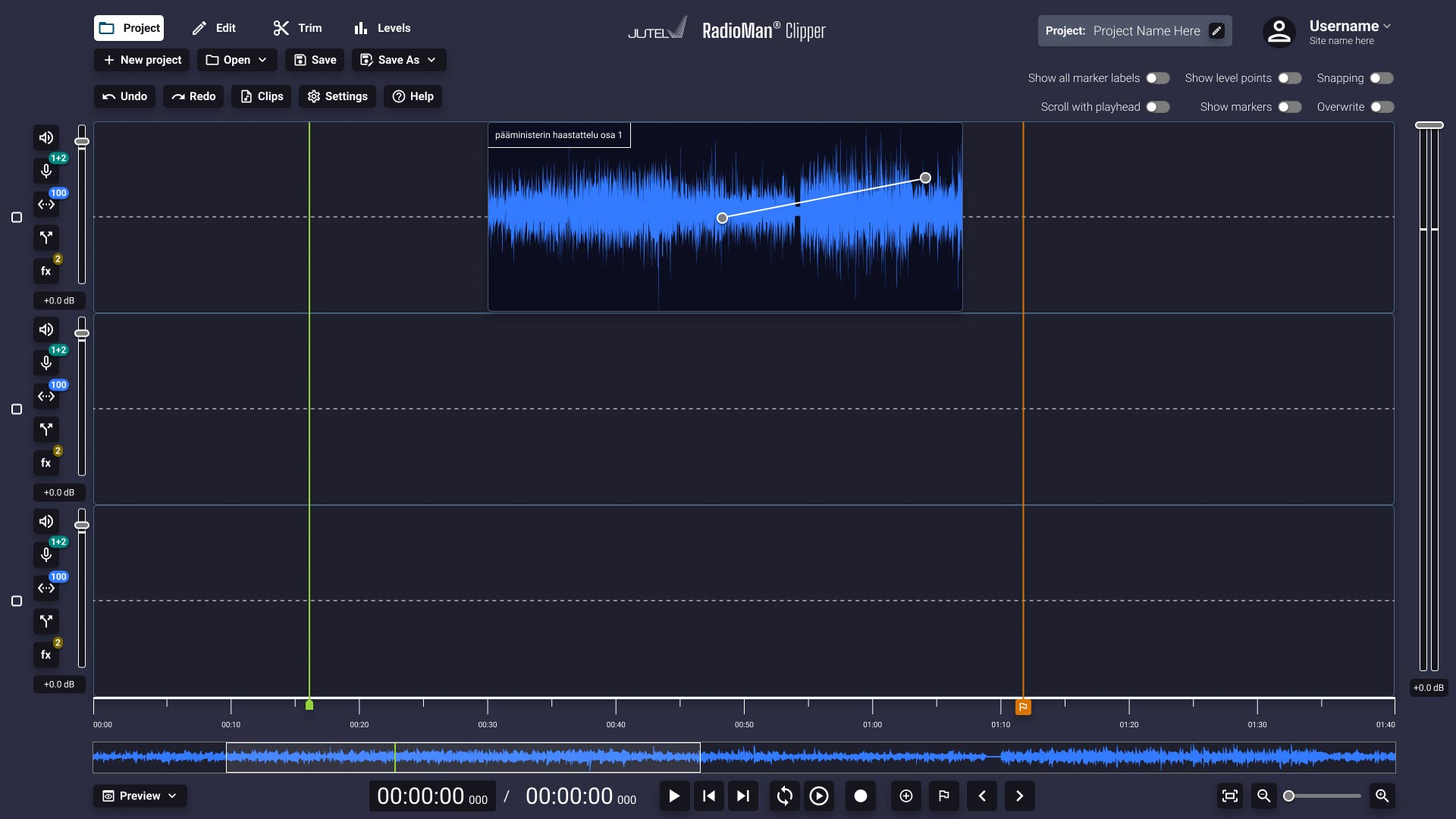

My task was to design the UX & UI for a cloud-based audio editing software for Jutel, ClipperAI®. The target audience is people who work with journalistic audio content, such as radio programs and interviews. It’s part of the successful Radioman family of software products that has been in use among radio professionals for a long time.
I was tasked with adapting the UX of their existing mobile recorder application’s MVP version into a full-fledged mouse & keyboard interface. It was inspiring and extremely interesting to get to design something that will be at the fingertips of experts in their own field, and getting a grip of the subject matter was a welcome challenge. The product is completely integrated into Jutel’s Radioman cloud environment so that audio professionals can access the same material on both their mobile devices and desktop or laptop computers for both recording and editing purposes. The material they are working with can then easily be transfered into the Radioman cloud, or to be exported locally to be used in radio broadcasts.
The project deliverables consisted of the designs for 9 views & a large number of modals, a compact design system for the UI components and an extensive interactive prototype that presented the core functionalities of the software.
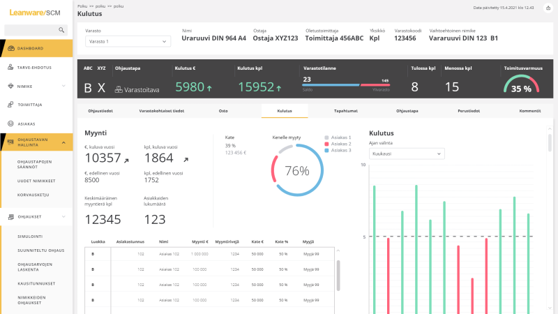
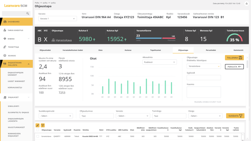
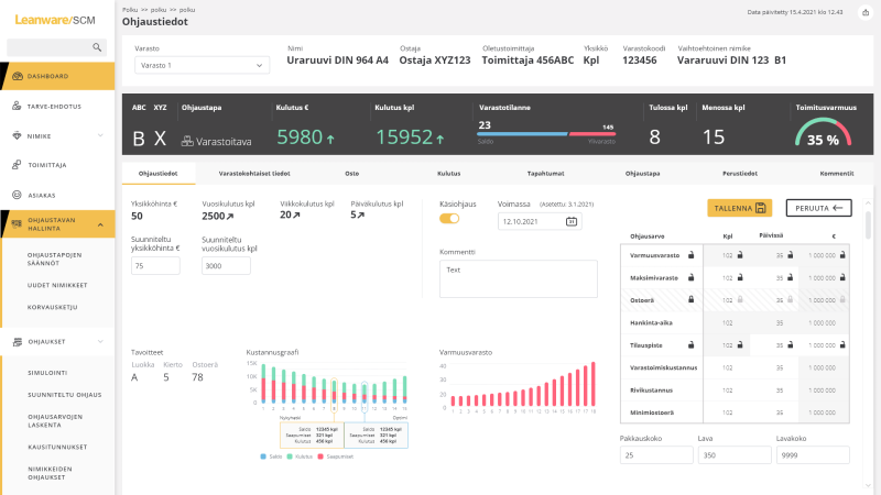
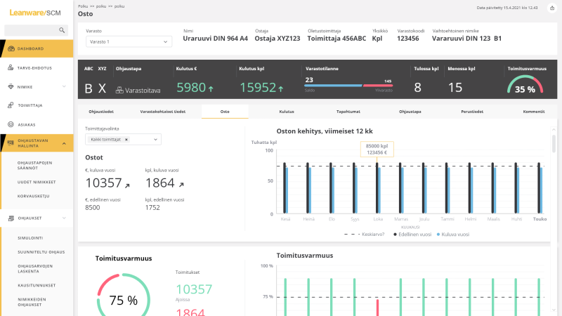
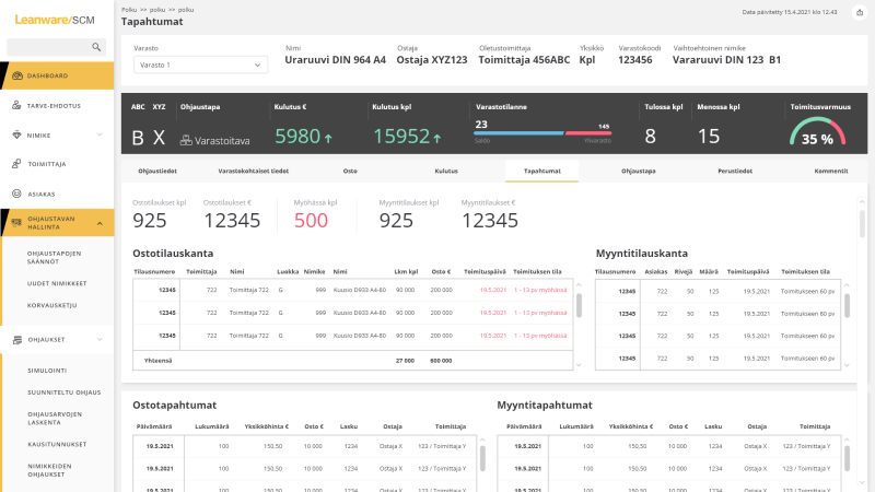
I worked as a UI & UX Designer in Leanware’s (nowadays Elisa IndustriQ) SCM (Supply Chain Management) project through TAIO. The product is meant to help companies manage their storage and shipping processes and to keep track of important key numbers to optimize throughput.
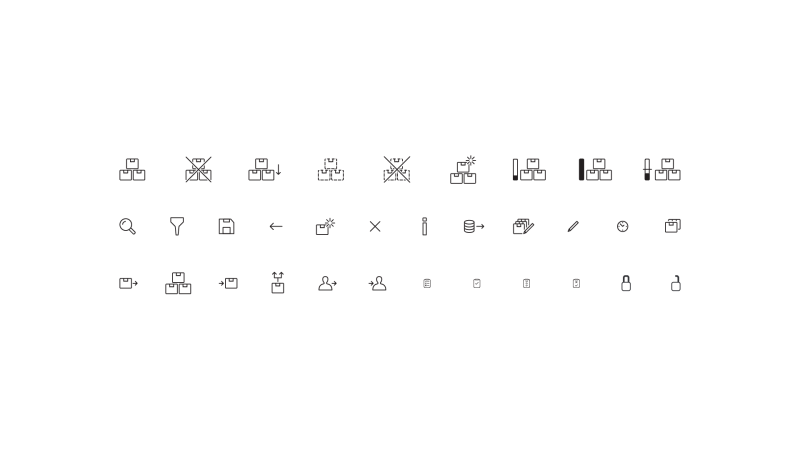
I was part of an agile software development team that had two designers working side by side with software developers and implemented designs for UI sketches and prototypes following the Senior Designer’s guidelines and suggested my own solutions to challenges that arose during the project. In addition I designed a lot of the icons for the project to be used as a part of the product’s User Experience.
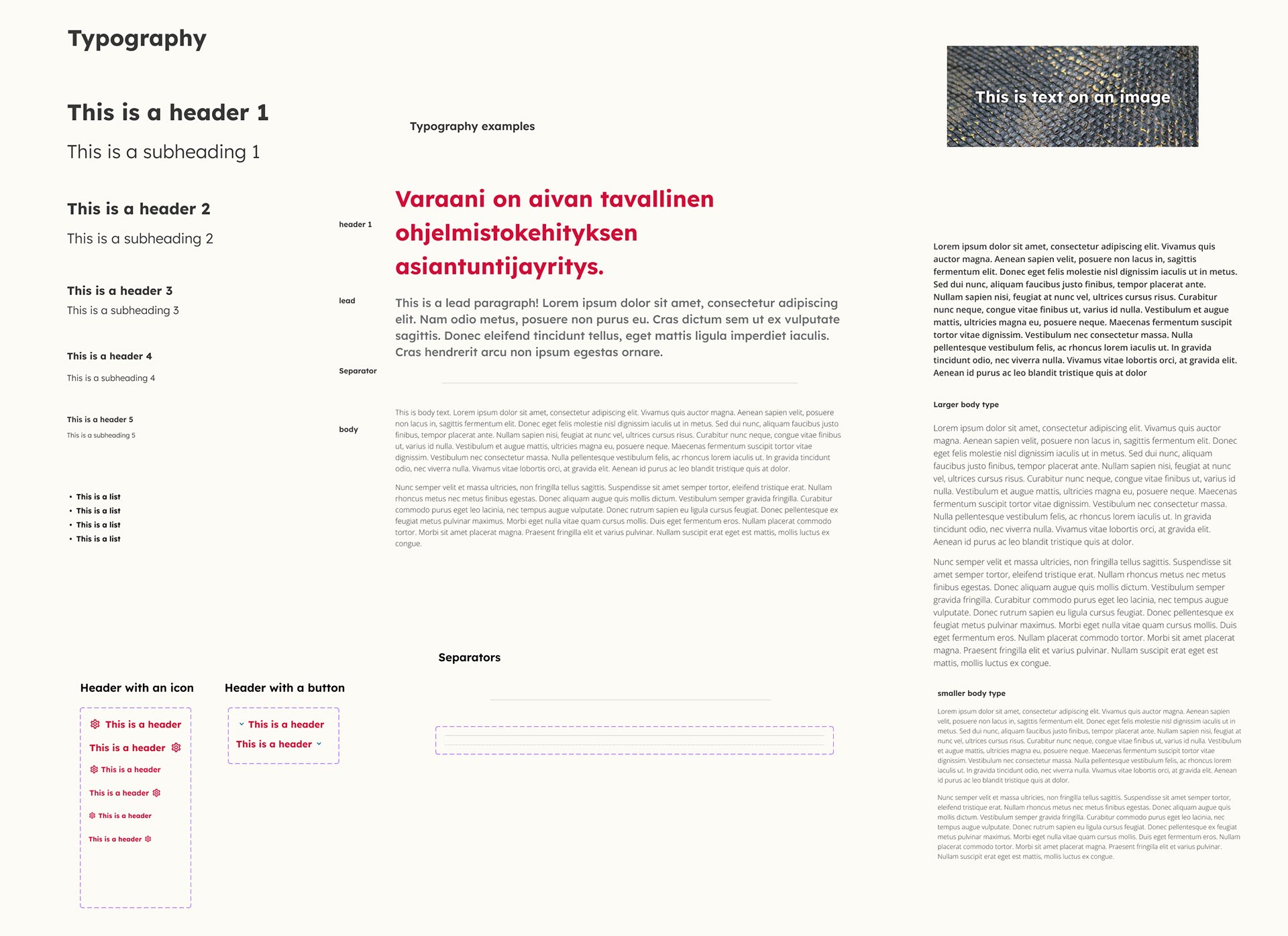
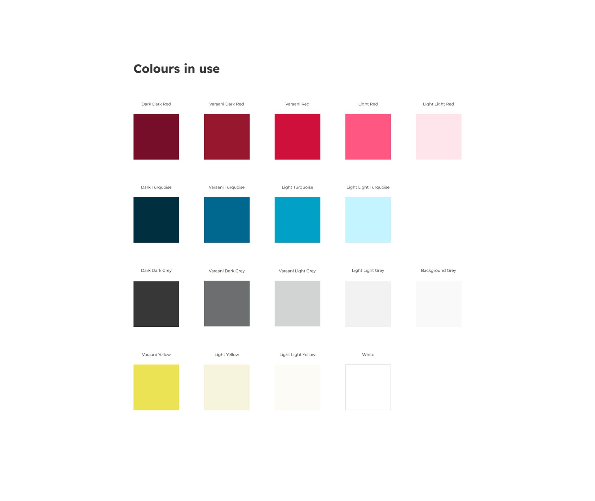
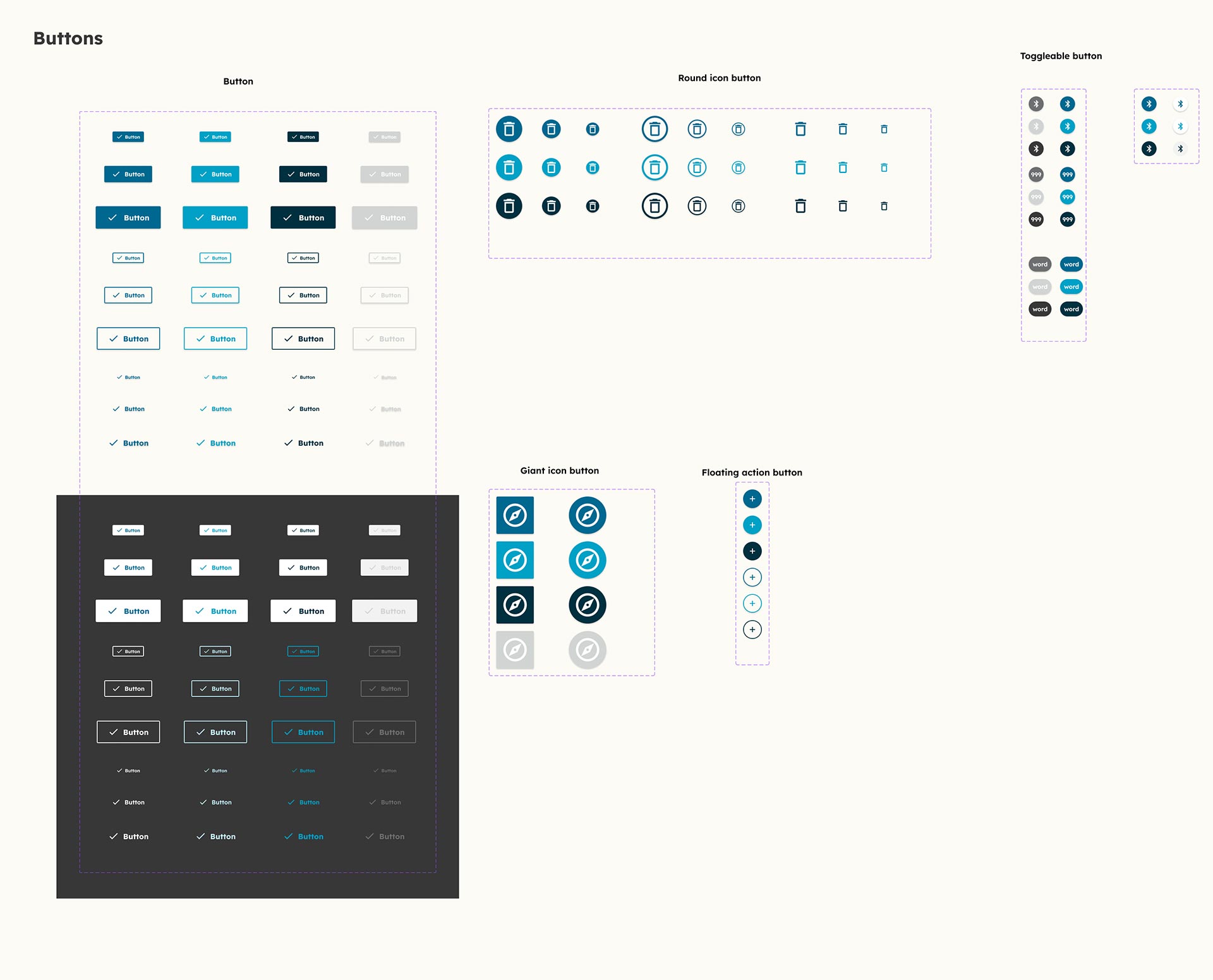
As my first assignment at my new place of work I created a Design System for our internal use. We already had a visual identity, but it was time to update it and consolidate it along with a component library and design system that could be utilized in our own projects, such as our website or any applications we might produce. I created several prototypes for imaginary web & mobile applications to test and validate the component library.
The aim of the project was primarily to deepen my knowledge of Figma and component & prototyping tools on a professional level, and to also gain real benefit from having our own design system. Both succeeded excellently, and the result is here. I utilized the design system to design and build our own website in WordPress, and having a practical aim to delve deeper into Figma really helped with grasping its complexities.
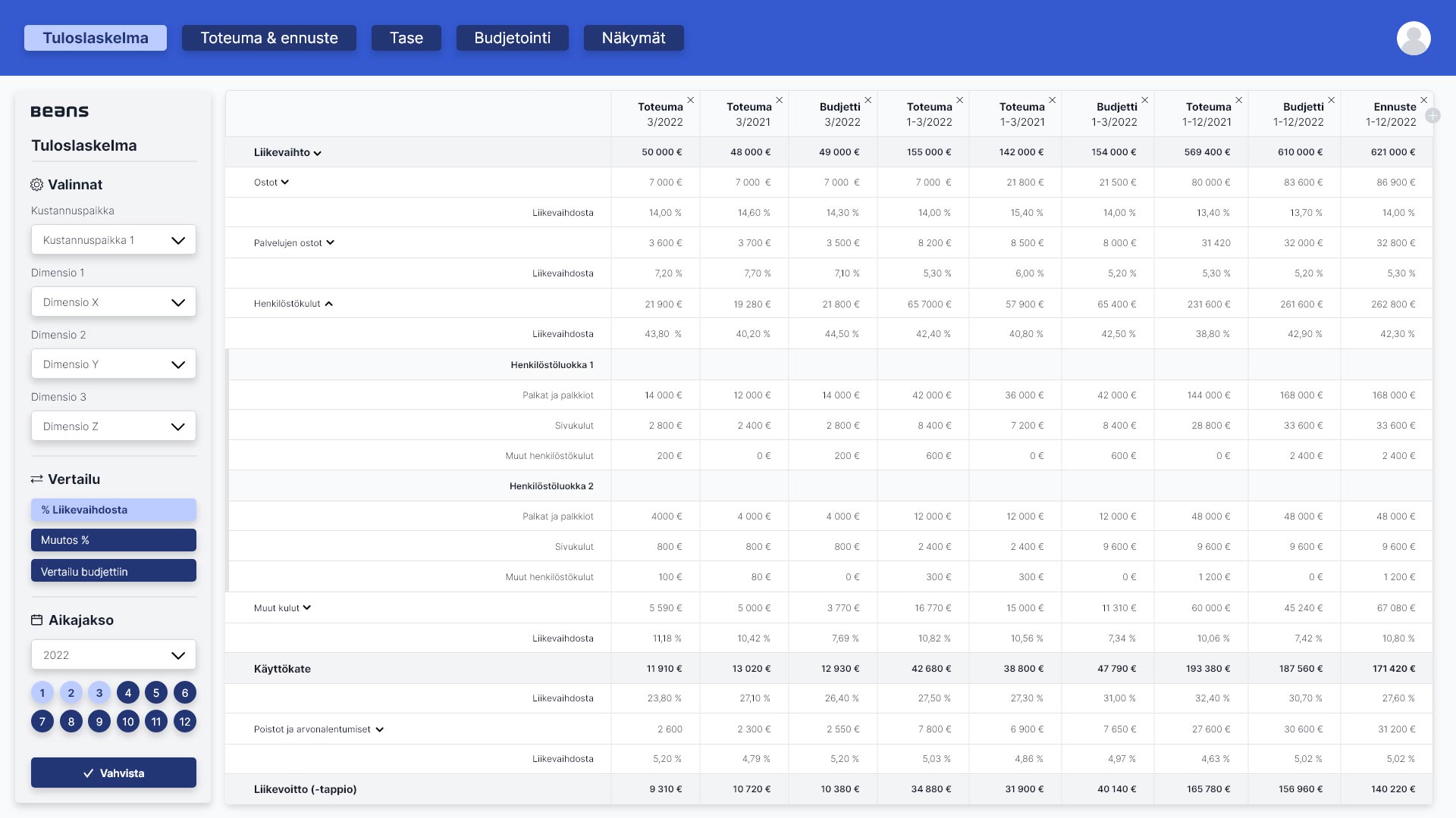
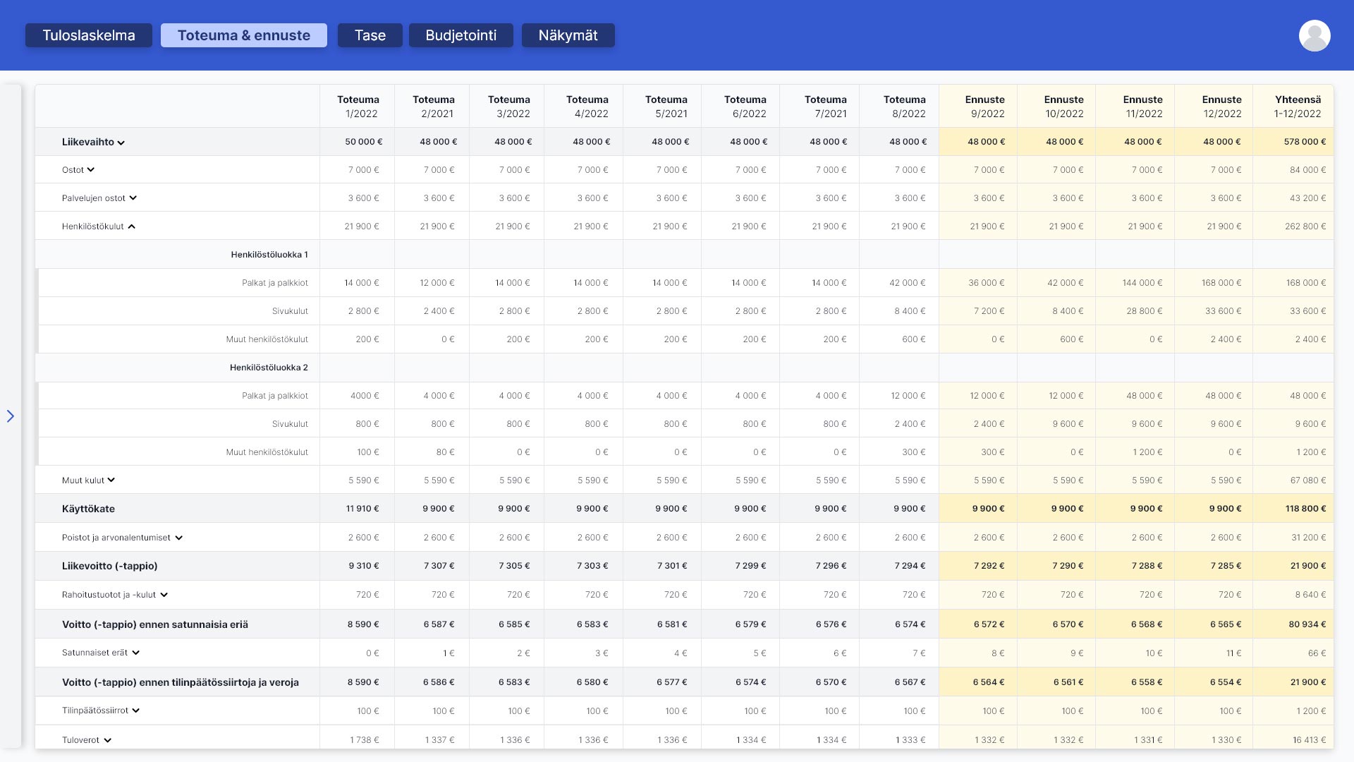
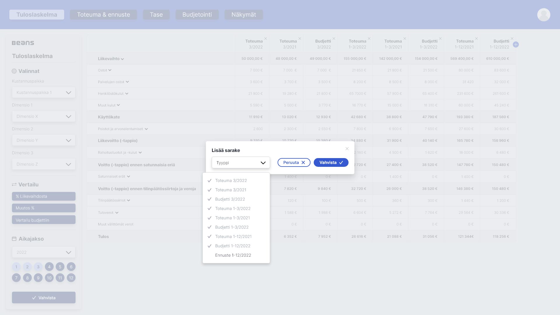
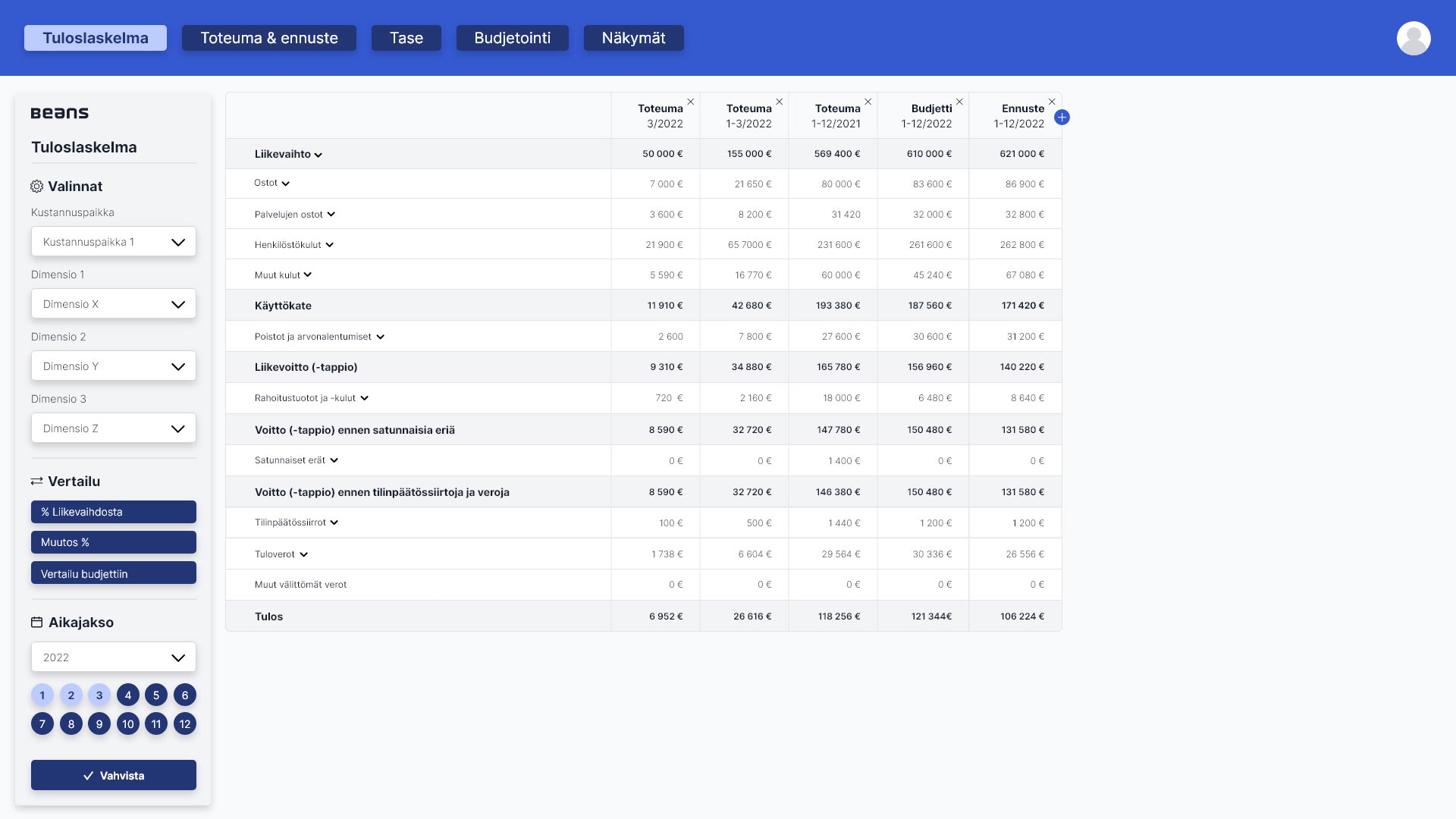
I was tasked by Beans to design the user interface for a software that is used to display and manage income statements for companies big and small. The client needed it to look like the Tailwind UI framework, so the components had to visually match that.
You can browse your financial data in different ways: choose the timer period, display and hide columns by your preference and needs, see deeper details, compare your numbers to previous time periods, and see predictions of income & expenses. The main challenge of the project was to simplify complicated numerical data to be displayed as clearly as possible, and empower the user to only look at the data they want to see so they don’t get overwhelmed by the amount of data visible.
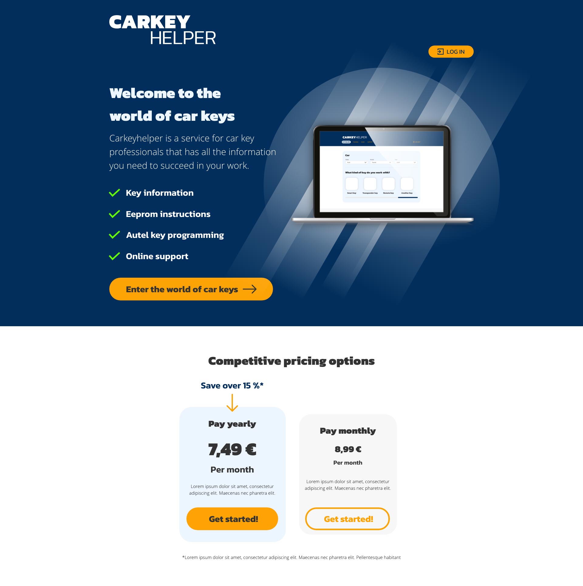
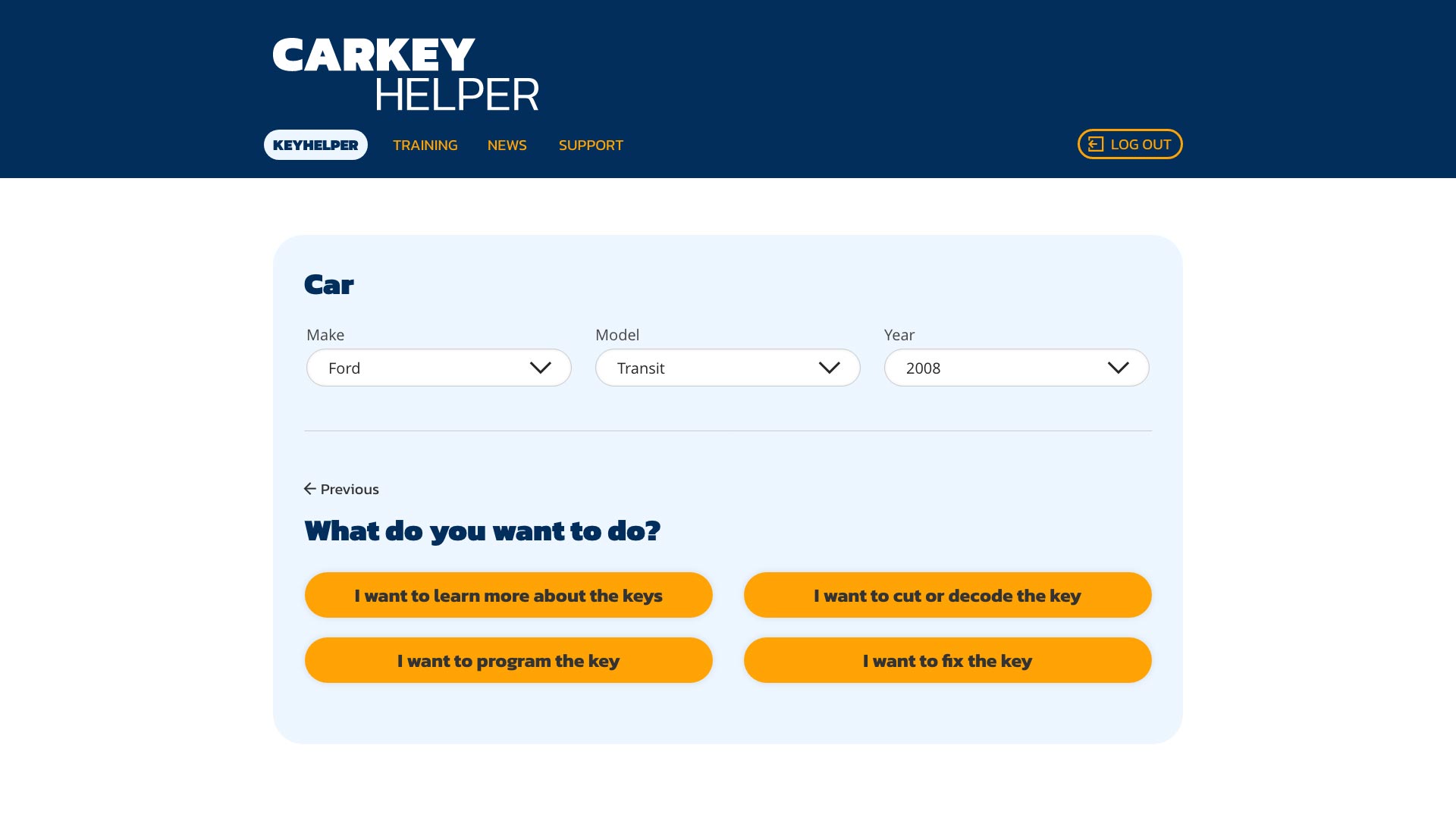
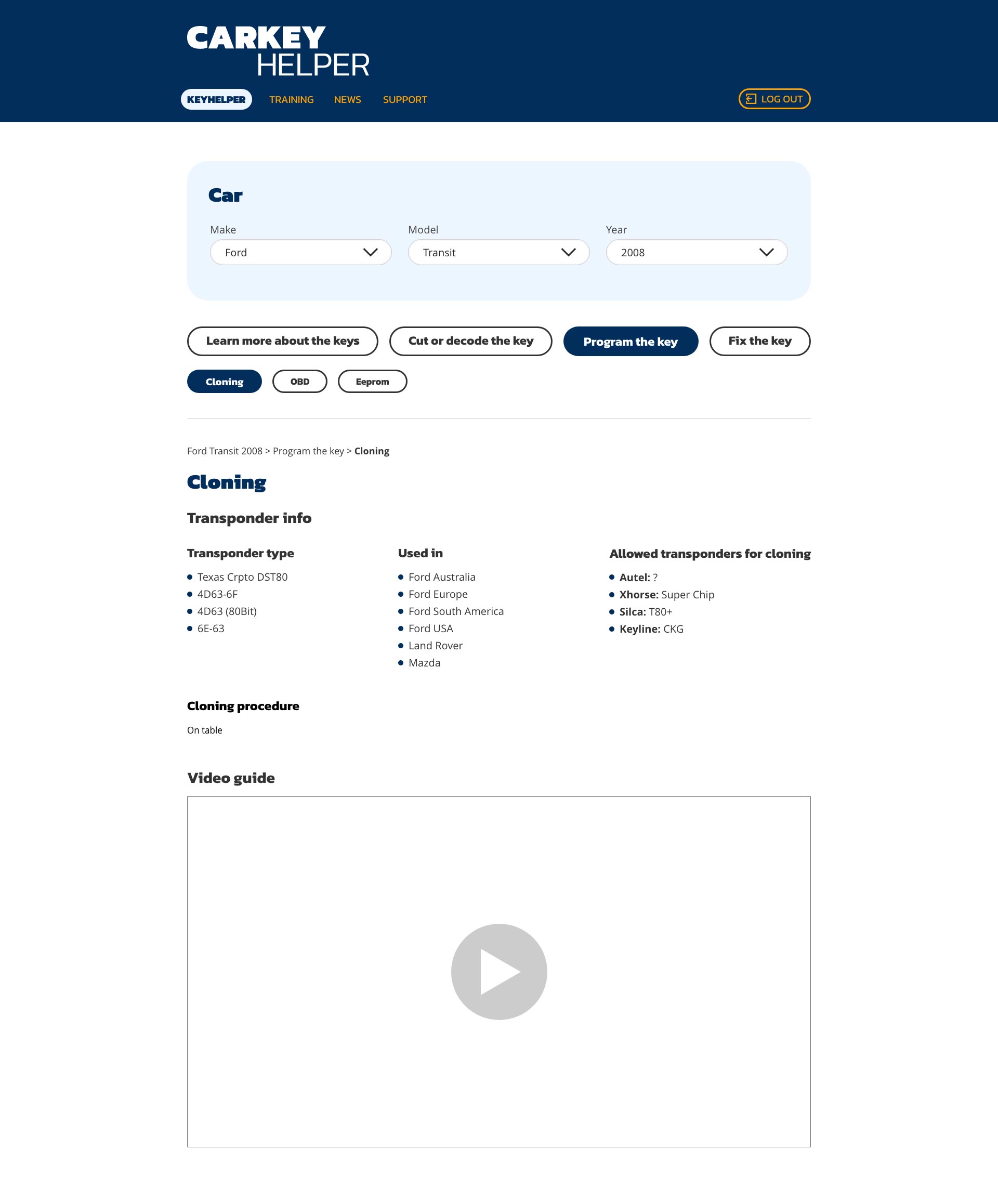
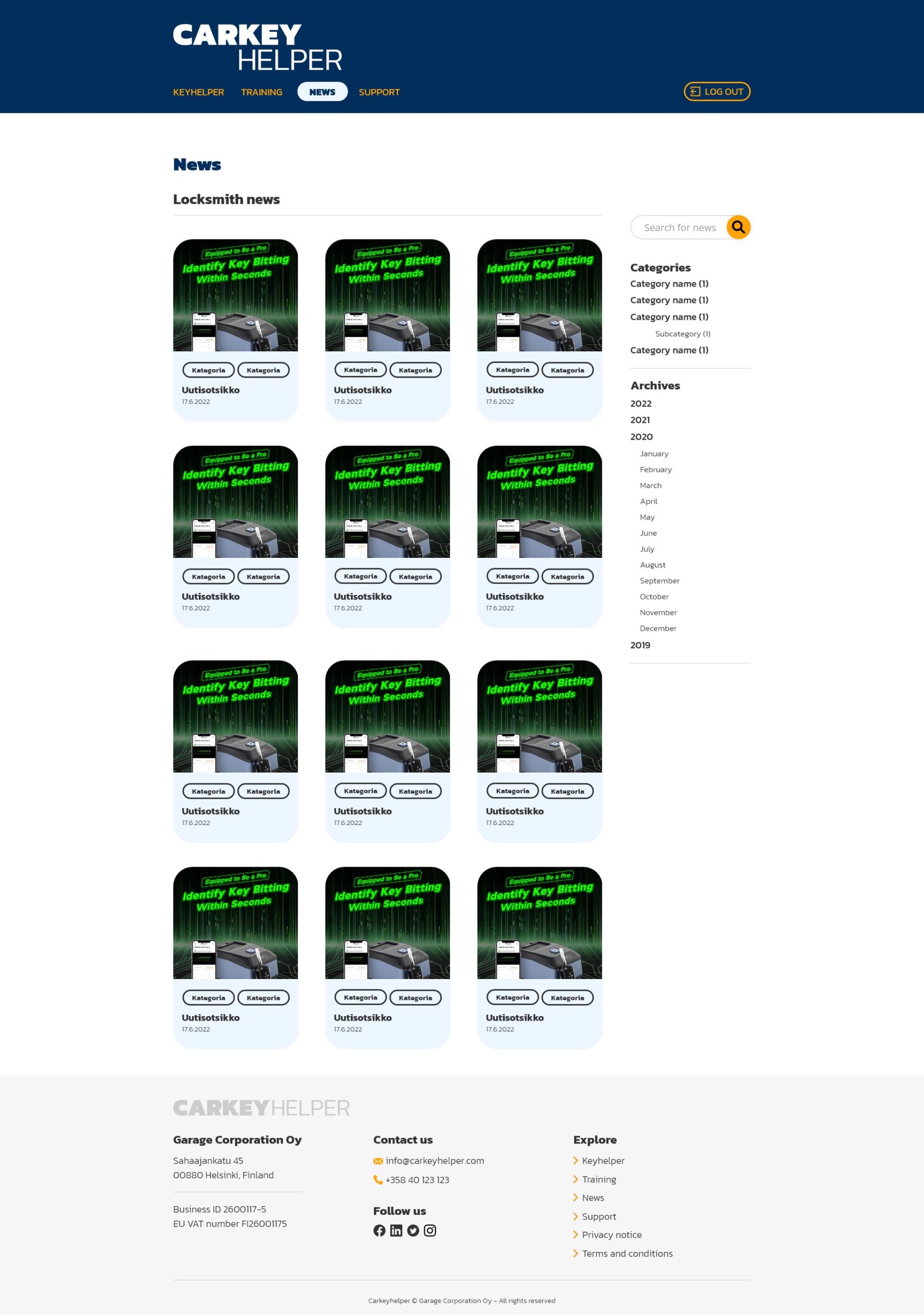
Carkeyhelper is a web application and tool aimed at car key professionals who repair and copy car keys, especially modern smart remote car keys. The idea is to function as a one-stop information database that contains text and image instructions, how-to-videos and product links to relevant tools. The service is structured so that the user begins by entering which car make, model and year they are working on, and after that they get all of the relevant information laid out of them.
The client tasked me to design the user interface and the visual identity of the service. In total I designed 11 different views, including the landing page and the information bank, both for desktop and mobile. In addition to that I designed the logo for the service and created a brand book outlining the visual identity of the service.
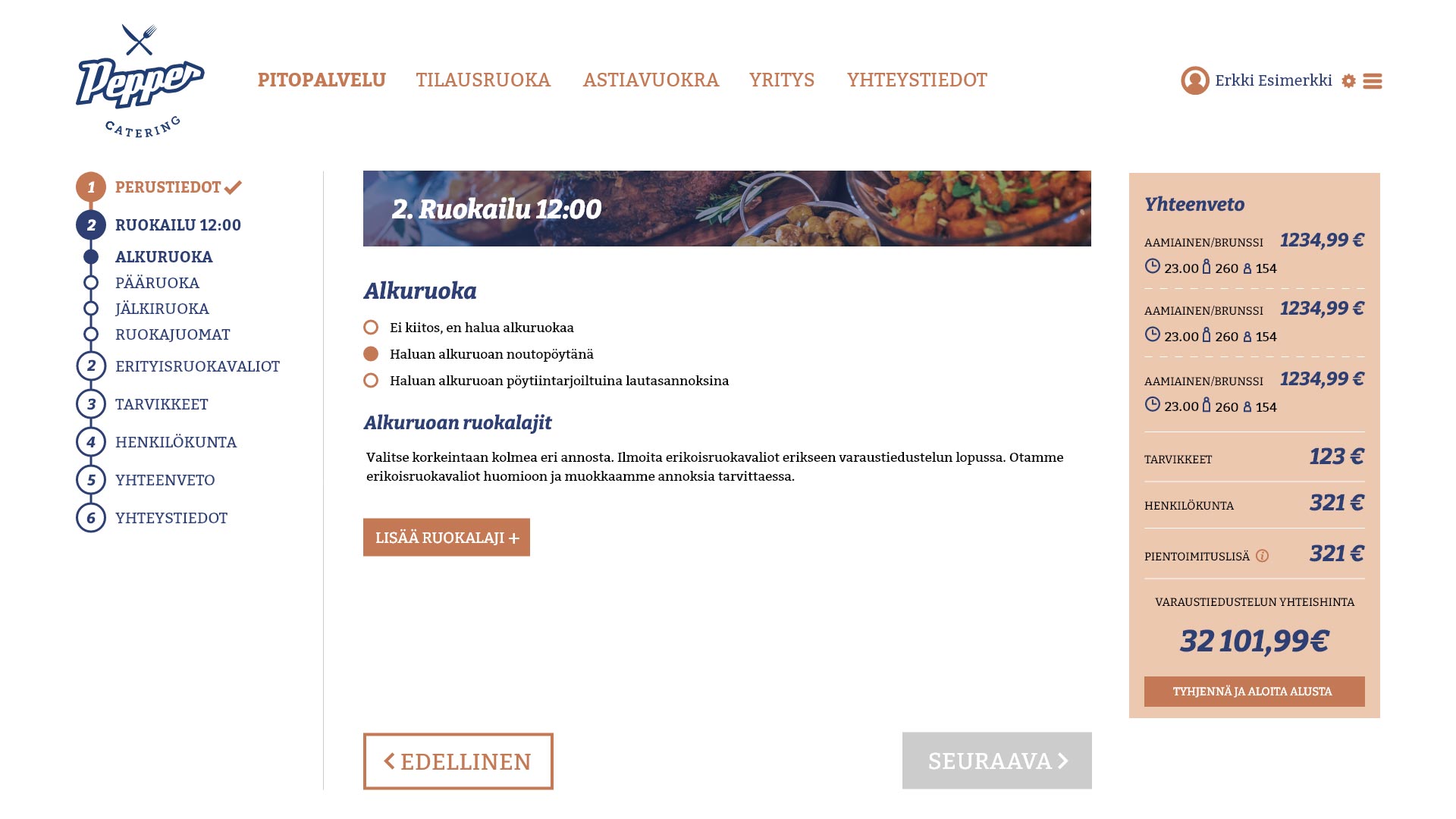
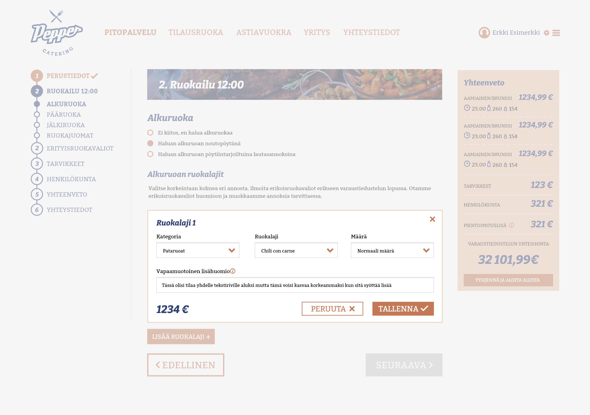
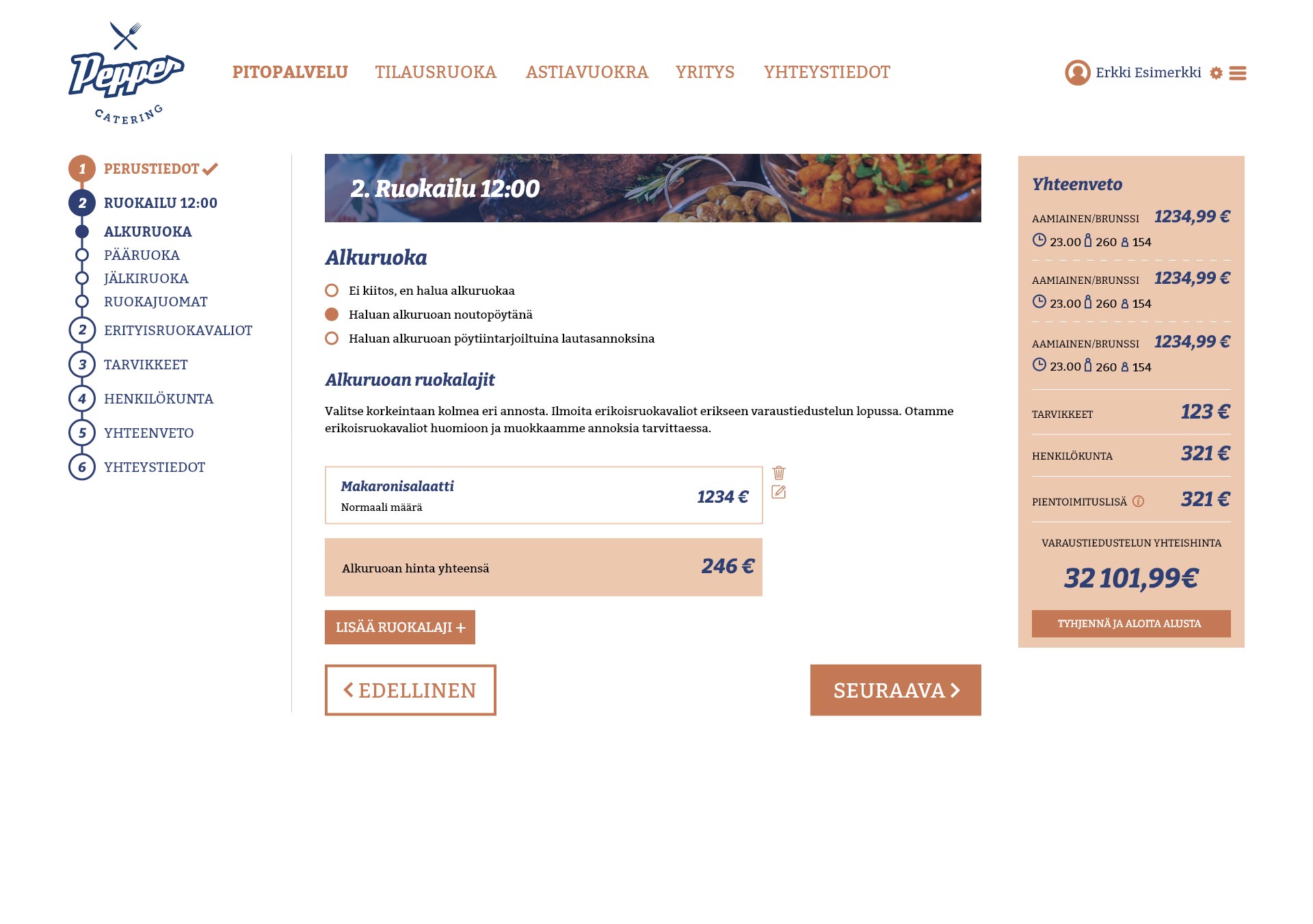
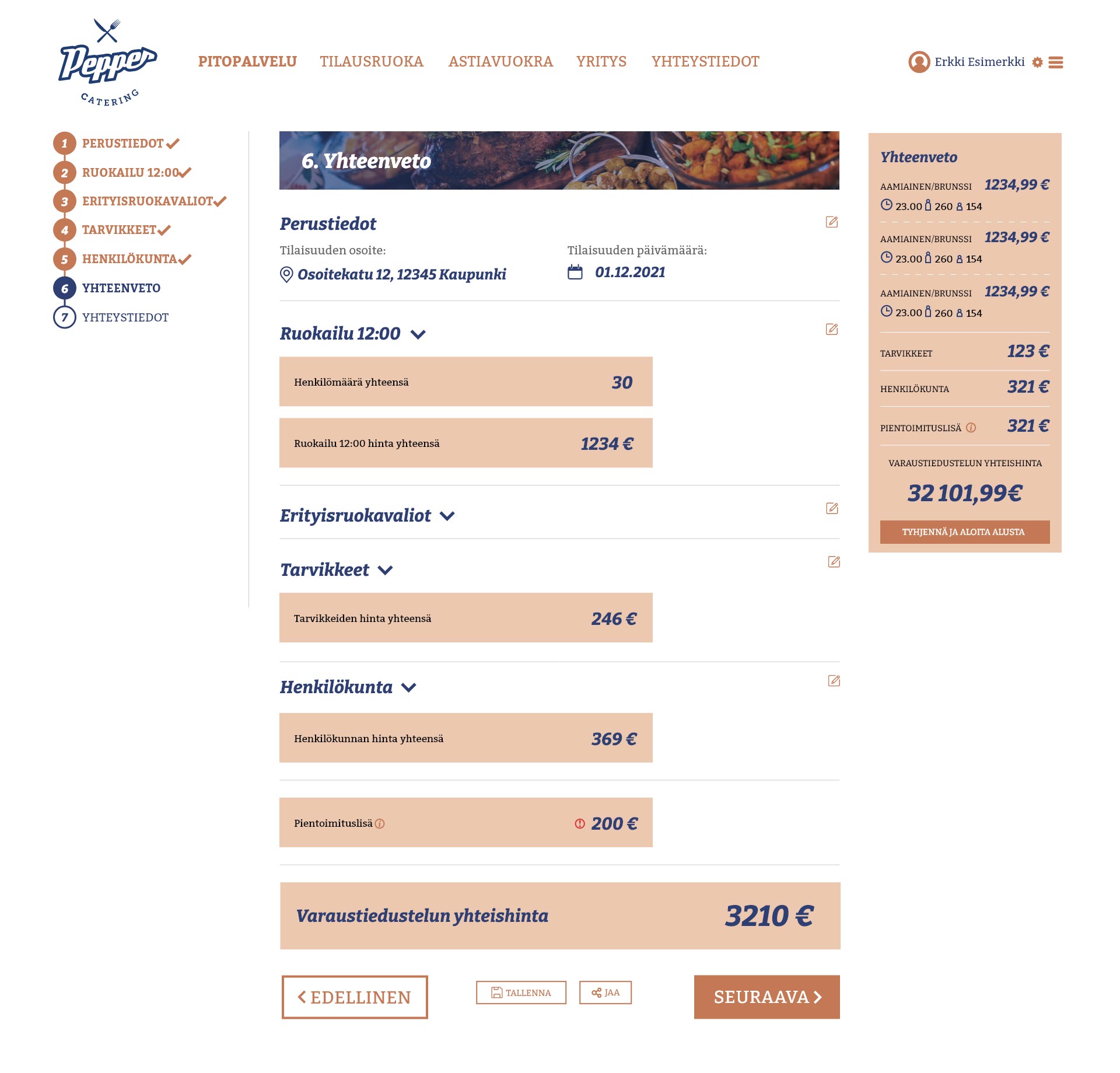
I was tasked by the client to design an interactive order system for their catering service. The client can enter the number of meals they want served at their event, when they are served, select courses for each of them, drinks, etc.
The system would track special diets and staff ordered for the event, and lay out everything broken down in a clear way so the customer understands what they are paying for. Then the customer can send the order and the catering company would take care of the rest.
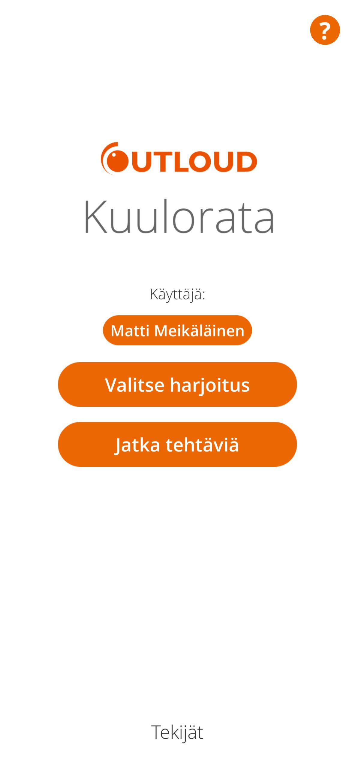
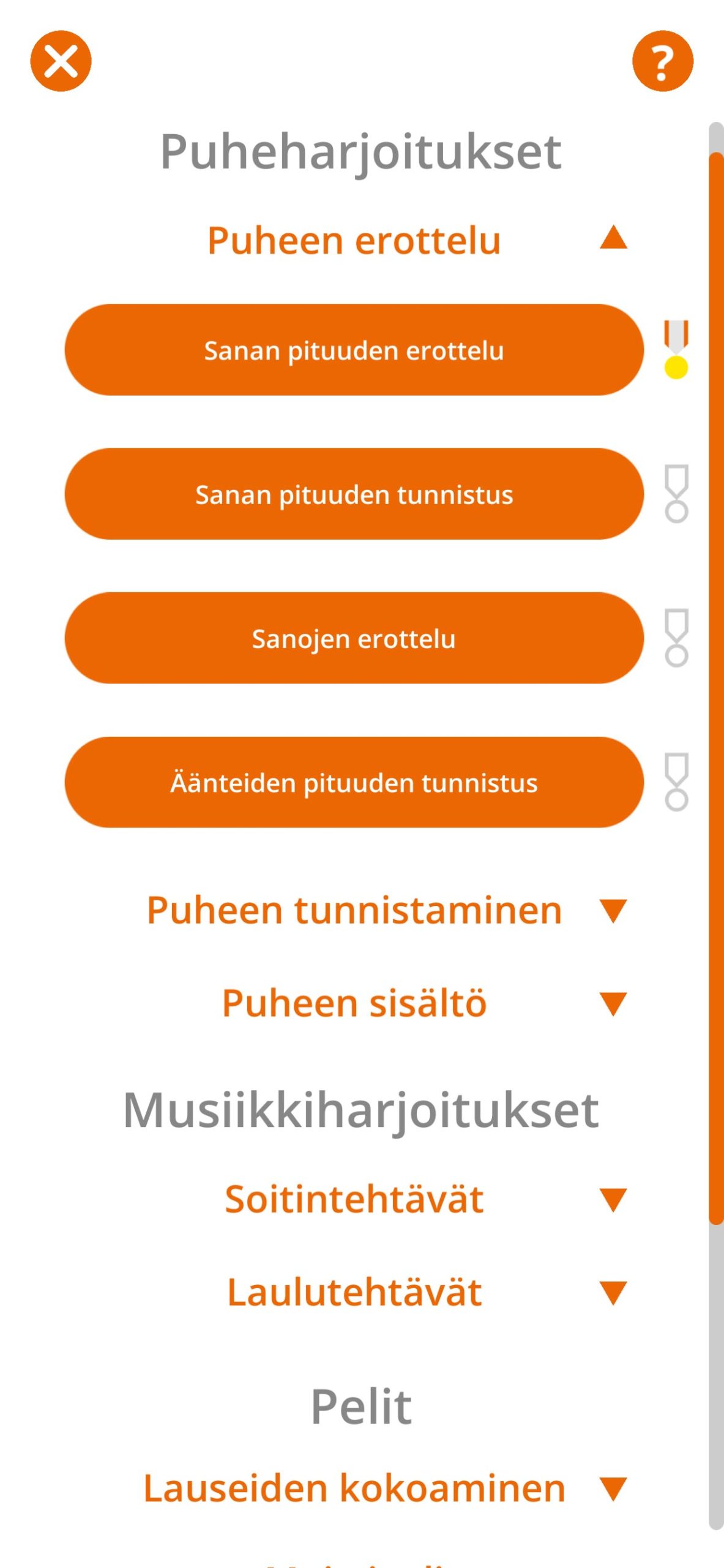
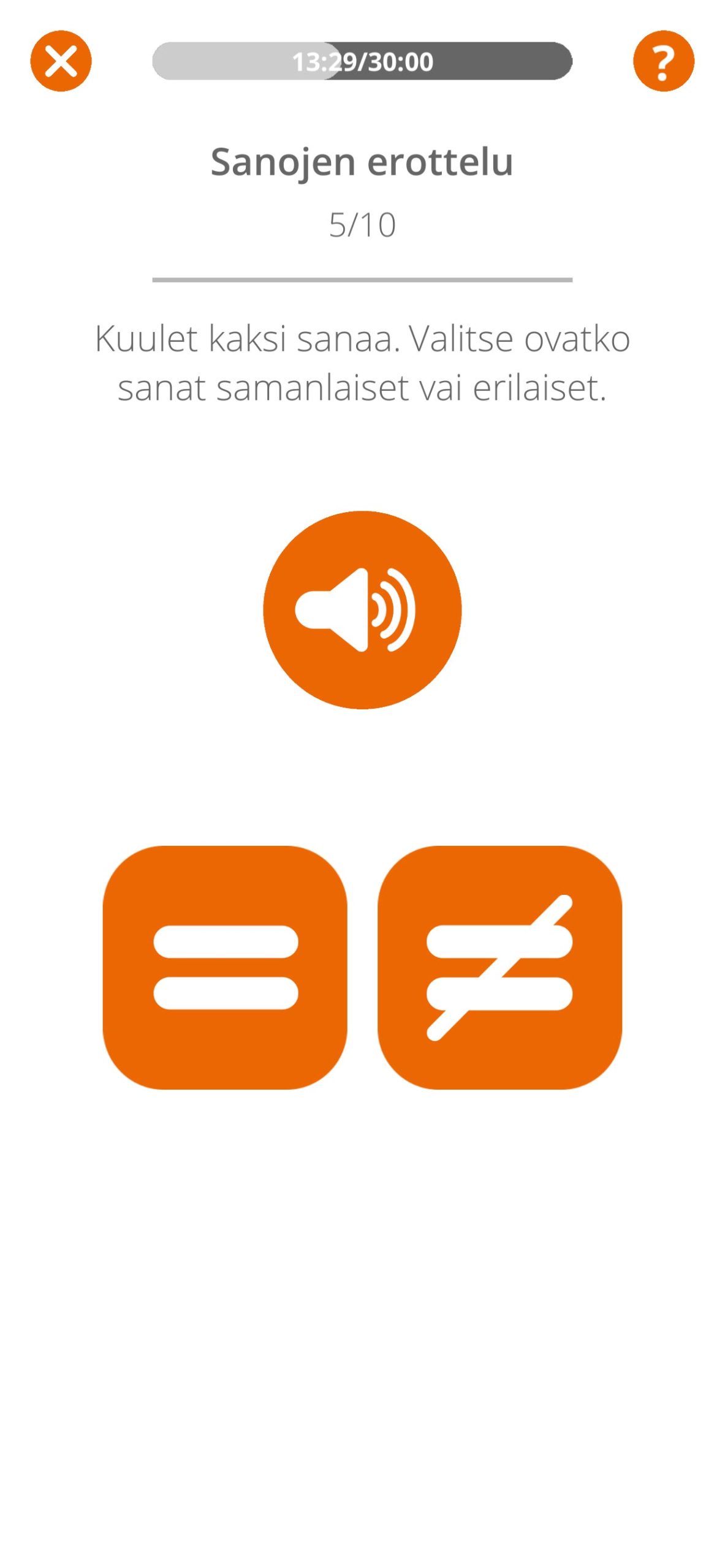
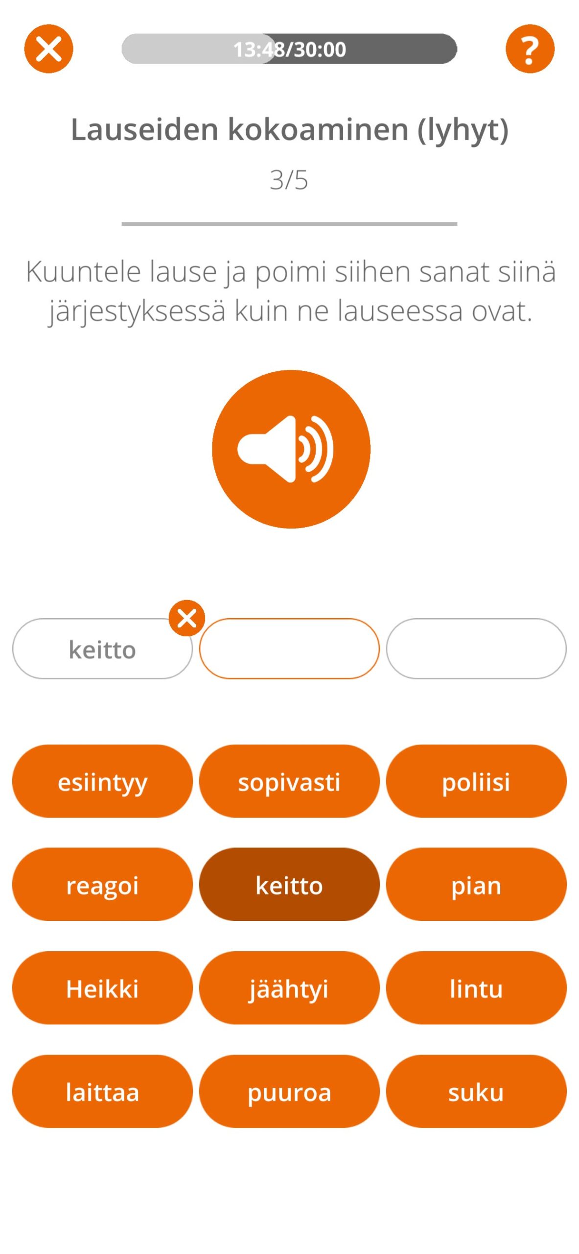
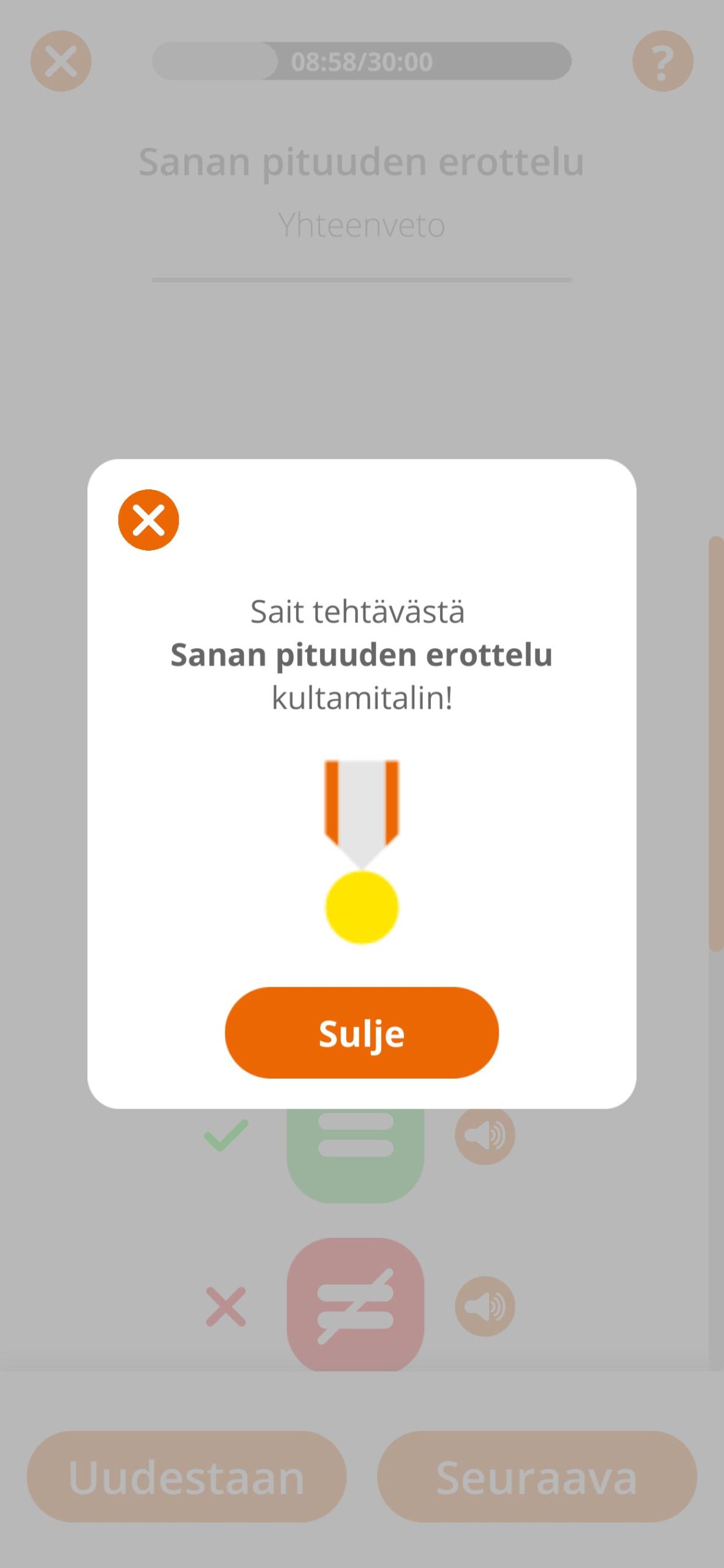
A mobile application designed for hearing practice for people with a cochlear implant or a hearing aid. The application contains several different kinds of practice assignments and games, all designed to train your hearing. The assignments contain both speech and music tasks. In our team we had several speech therapists from Tampere Central Hospital, Helsinki University Hospital and the University of Oulu who specialize in this field as consultants, and they provided insight to the contents of the application.
The material and contents of the application are based on a set of printed hearing excercises widely in use throughout the speech therapy field. Our job was to bring them up to a modern standard to be used easily and quickly with a mobile application. My task specifically was to design the look and feel of the application, in addition to the User Interface.
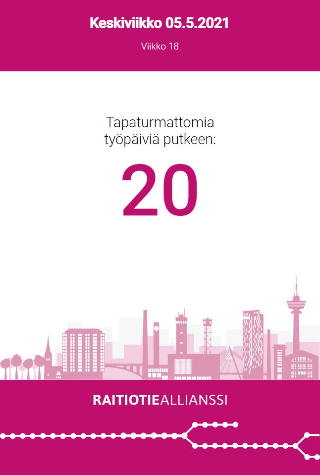
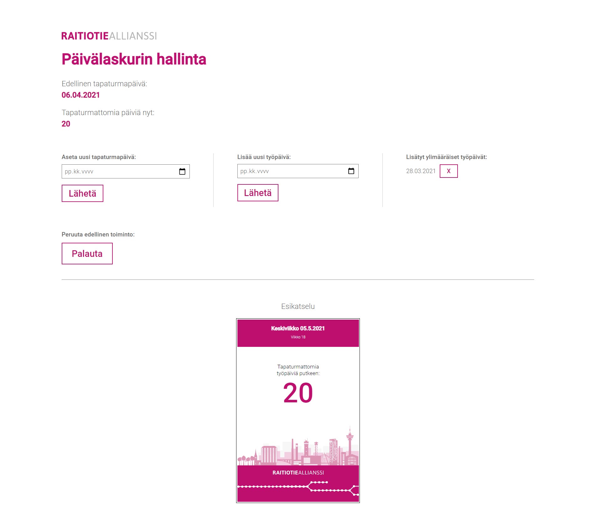
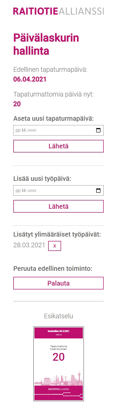
Day counter web application for Tampere Tramway Alliance
A web application meant for internal Digital Signage and Intranet use for the Trampere Tramway Alliance. It consists of two parts. The first part is the actual display page that shows the current date, week number and the number of days since the last accident was submitted. The page is displayed on a Digital Signage smart display at their office, in addition to their Intranet service. The second part of the application is a management page where the Tramway Alliance can go and submit an accident for a certain date, and add additional workdays for holidays so that the “days since” counter represents the correct number.
I designed the visual look and feel of the page, the UI & UX, and built the responsive webpage templates for both pages to future-proof the project for different display sizes and aspect ratios, and also ease of use for the management page independent of what device or screen the management page is used on. Outloud’s fearless developers programmed the backend and functionality for the pages.
The pages are understandably not meant for public viewing, and the numbers shown on the screenshots are example values we used in our tests, and have nothing to do with the Tramway Alliance’s actual statistics.